
This post was most recently updated on March 1st, 2021
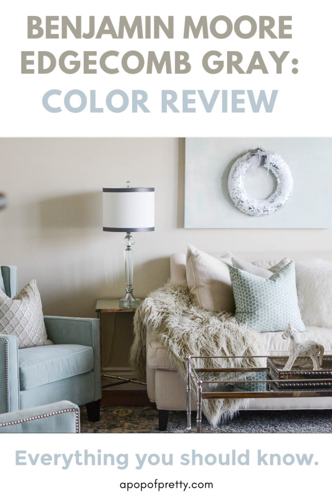
In this article: I’m talking all about Edgecomb Gray Benjamin Moore, a gorgeous neutral paint color or griege (part gray and part beige). Are you wondering how it compares to similar colours like Revere Pewter or Pale Oak? Or maybe you are curious how to pair it with complementary colours? I’ll talk about these topics and more in this article.
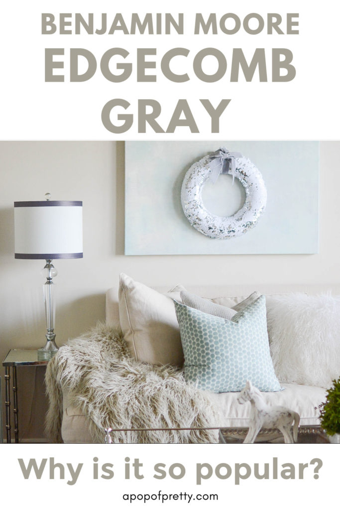
Edgecomb Grey Benjamin Moore HC-173 is one of my favourite paint colours. Yet, I haven’t spent much time talking about it here on the blog. It’s one of those classic, tried and true Benjamin Moore paint colours that you almost take for granted. But, whenever I post a photo of a room on my Instagram that was painted with Edgecomb Gray, I ALWAYS get questions about the paint colour!

A Perfect Light Greige
I am not at all surprised that I get asked so often about Edgecomb Gray. It’s a gorgeous soft, warm gray paint colour. It reads as a greige, landing somewhere between a light taupe-y beige and a true, warm gray. If you’re wondering what the heck greige is, don’t worry, lol. It’s just a fancy word for colours that read as both gray – hence the ‘gr’- and as beige – hence the ‘eige’! (You know, kinda like Br-angelina – OK maybe I’m dating myself haha!)

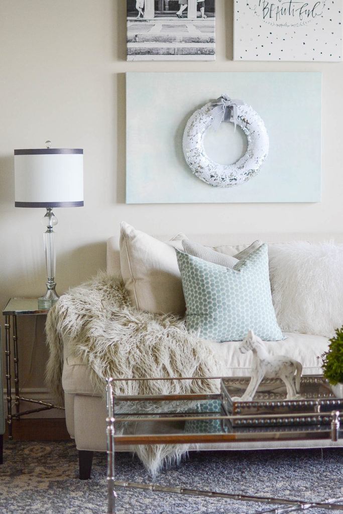

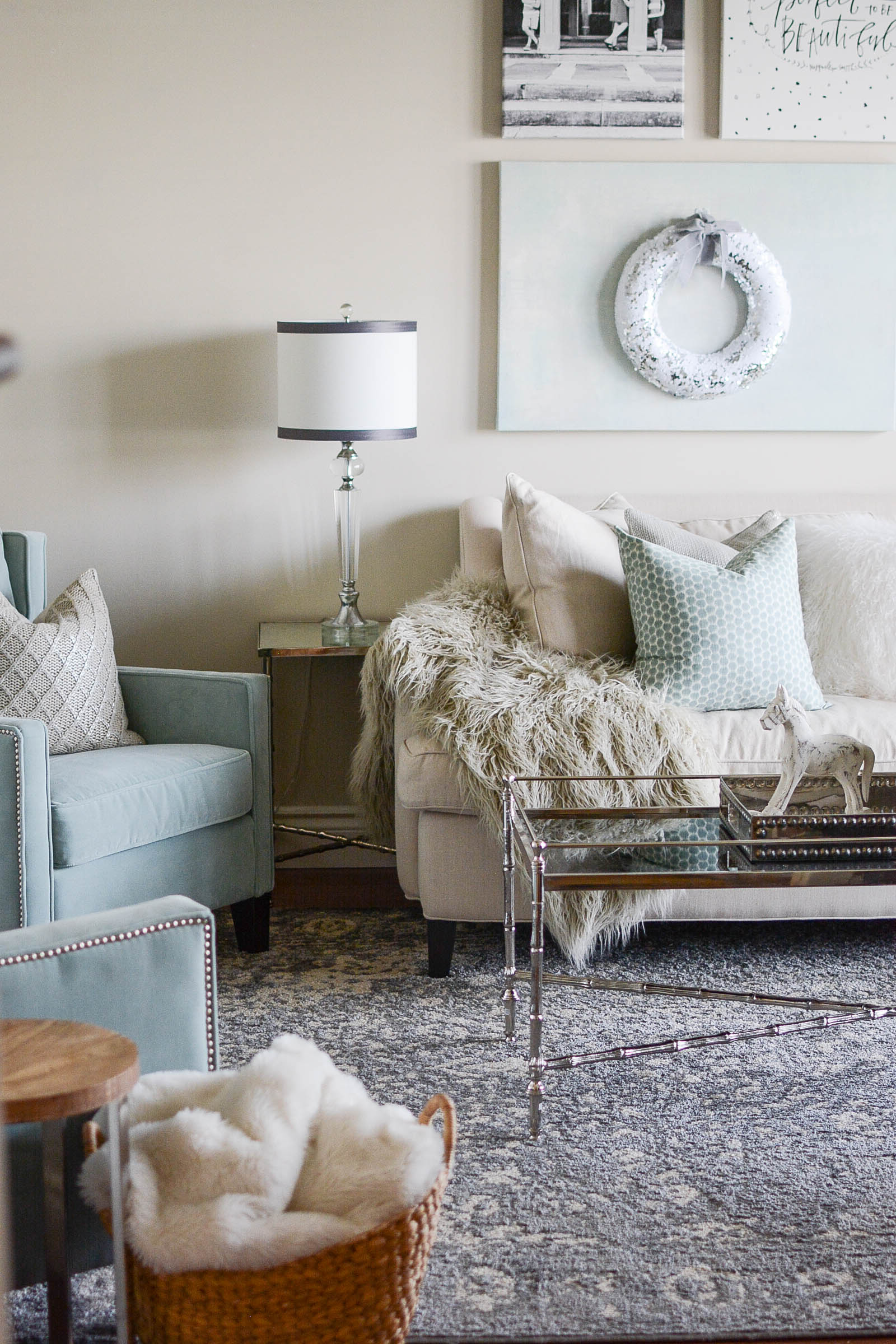
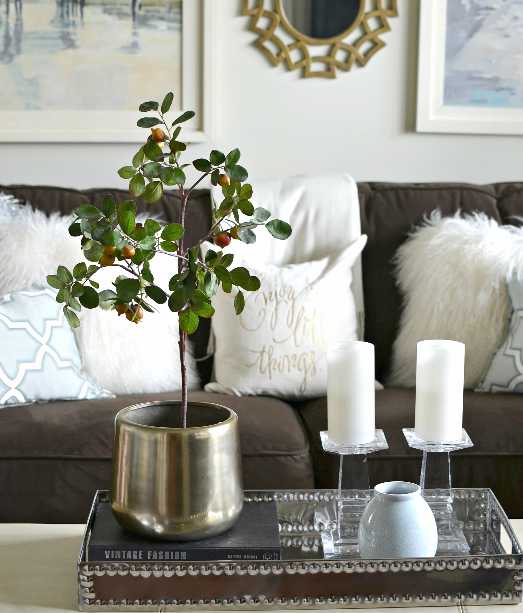
Edgecomb Gray Benjamin Moore reminds me of linen, and in fact, almost matches our linen-hued sofa! I love it because it is light enough to keep a space feeling airy, yet it has enough depth and mood to still feel like a colour and not just an off white. Benjamin Moore describes it as a soft, earthy, organic neutral, and a “go-to grey that’s timeless with a modern edge”. It is definitely a neutral that would work in almost any space.

Edgecomb Gray Coordinating Colors
I’ve had Edgecomb Gray in my living room for at least four years which is really something for a constant room tweaker like me. It even survived a room makeover because I didn’t see any reason to change it when we purchased new living room furniture last year. When you find a great neutral that is versatile like Edgecomb Gray there’s no reason to re-paint every time you update something in a space.
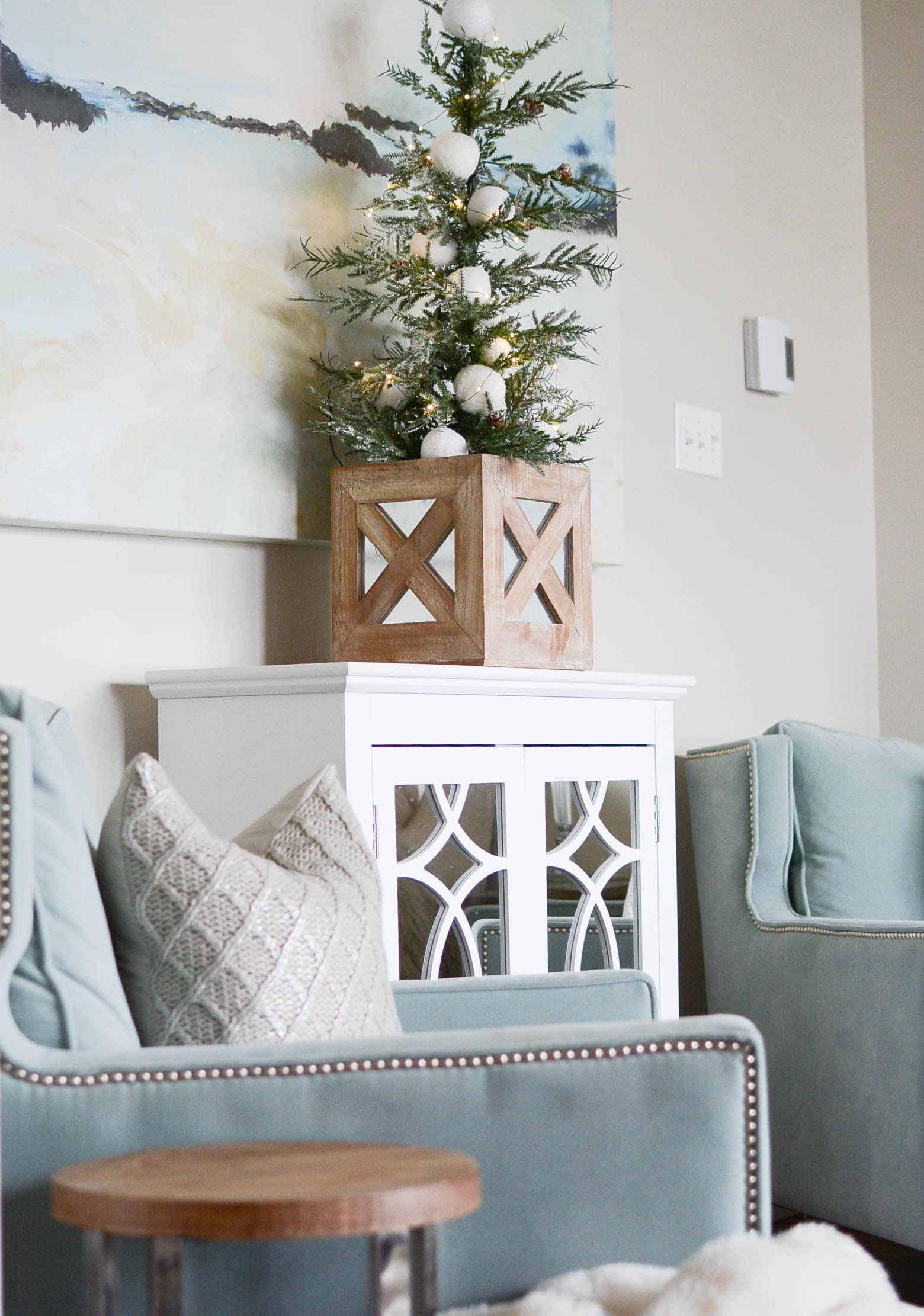
A lot of people ask me about Edgecomb Gray coordinating colours (or, in other words, Edgecomb Gray complementary colours). And, my answer is that it’s one of those colours that you can pair with lots of accent hues. I particularly love how it plays with cooler tones and blues. You can see how well it pairs with pale blue like our sea foam chairs. And, even though it’s a warm gray, it looks awesome with the cooler grays in our rug.

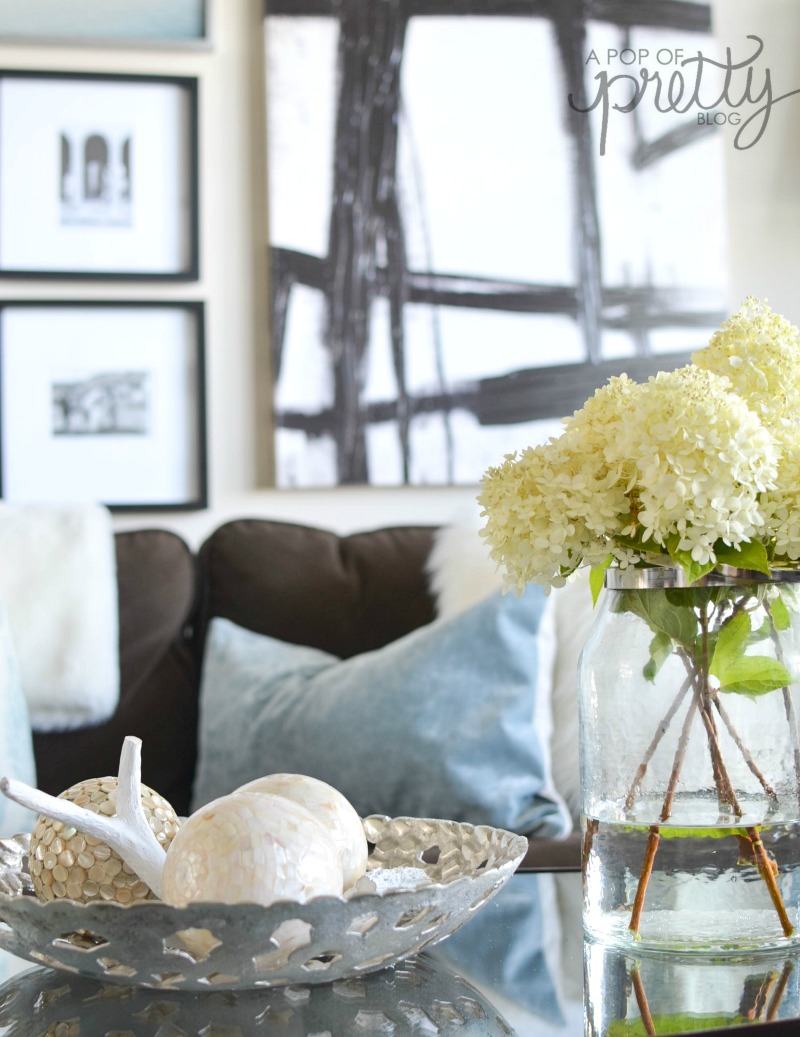
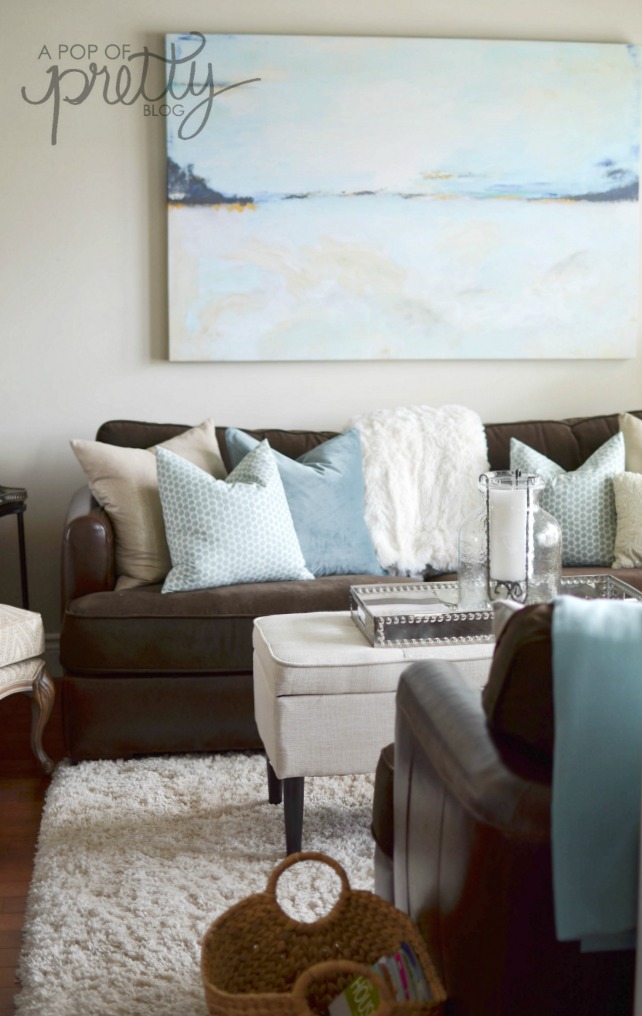
Edgecomb gray coordinating colors even include warmer tones. Before buying our linen sofa, I had a chocolate brown couch in this room. And, it has looked just as perfect with this paint colour. You can see it below.

Edgecomb Gray vs Pale Oak
Are you wondering about Edgecomb Gray vs Pale Oak? These two paint colours are similar, but they do have some differences. I have used Pale Oak throughout our summer home and I absolutely love it. But it is a little lighter and airier than Edgecomb Gray. In fact, it can read as more of an off-white than a griege. If you are looking for a true griege, I’d stick with Edgecomb Gray. It feels a little earthier. However, if it’s little deeper than you’d hoped for, Pale Oak might be a better option. Check out my review of Benjamin Moore Pale Oak for more detail and photos: Benjamin Moore Pale Oak OC-20 Colour Review.
Edgecomb Gray vs Revere Pewter
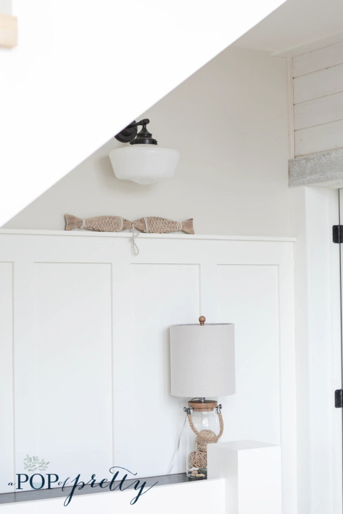
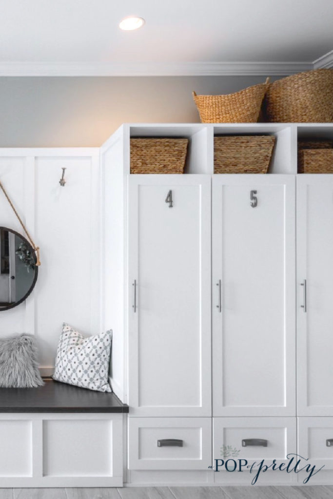
Edgecomb Gray vs Revere Pewter is another comparison that I can shed some light on. We used Revere Pewter in our Mudroom, and it is definitely more of a gray than a beige. These two paint colours can look similar, depending on lighting, but Revere Pewter is definitely a cooler colour. Another thing to consider if deciding between Edgecomb Gray vs Revere Pewter is lightness. Edgecomb Gray is significantly lighter. I find that Revere Pewter feels more like a medium gray than a light neutral, depending on the time of day. I like using it when there’s lots of white trim work in a space. You can see Revere Pewter in our mudroom in the photo below (above the cabinets).
Should You Consider This Paint Colour?
Yes, absolutely! If you are looking for a soft, warm greige, I’d definitely recommend looking into Edgecomb Gray Benjamin Moore. BUT I always suggest starting with a sample in your space before committing to a gallon or more. That’s because paint colours will always look different depending on how much natural light your room gets.

Also, paint colours will always look a little different on your computer monitor than they will on a wall. So make sure to test it out in your space first.
Have an awesome day.
Until next time,
K.