This post was most recently updated on September 23rd, 2019
A couple of weeks back, I posted about a room that I was re-decorating with furniture from another room in our house. If you’re following along here, you might remember my small main floor TV room / den that got hand-me-down furniture from the living room.
In that post a talked a little about “the power of the pop” – the idea that using bright accessories against neutral backdrop can trick the eye into focusing on the accessories, rather than the walls and furniture.
Back then I showed you this:
Then, I showed you this…
I loved the bright pops of red, but I wasn’t head over heels. The more I lived with it, the more I realized that that wall needed some help. For starters, the canvas wasn’t wide enough. Secondly, you can’t tell from this picture, but this room has nice high (2-story) ceilings, and I wasn’t taking advantage of that height. I wanted to draw the eye up.
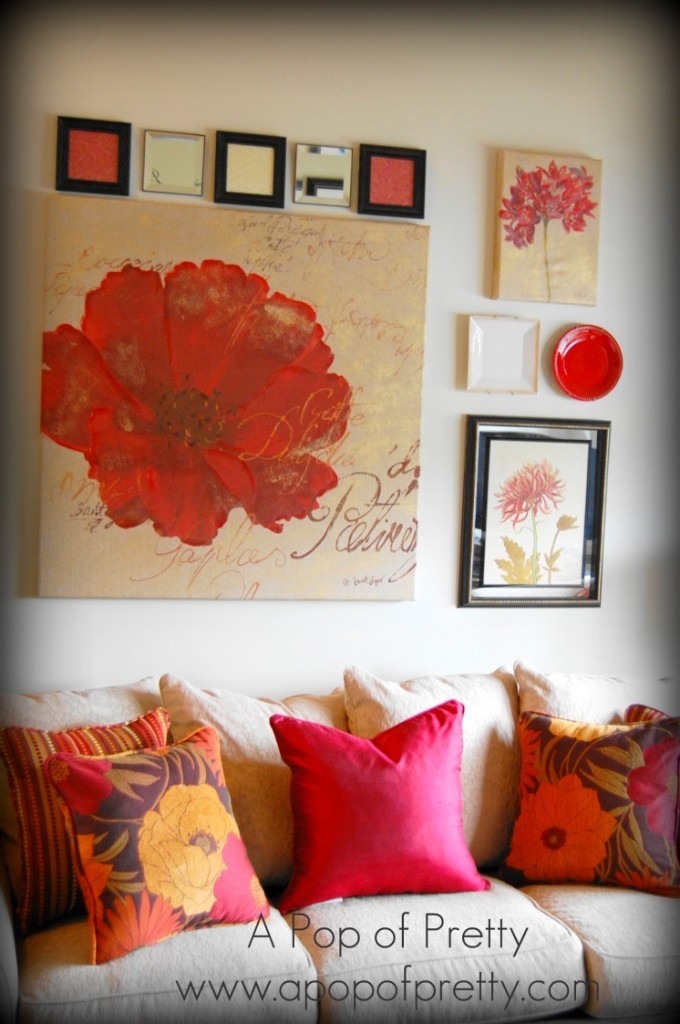
So after a little brainstorming, shopping and tinkering, here’s what it looks like now:
I was lucky enough to find two additional pieces that coordinated with the poppy canvas. One of them was by the same artist, and the other had the same vintage botanical feel and was framed in mirror. You may have noticed that I a big fan of the ‘collected room’ look. You’ll see a lot of plates around my house these days; they seem to be my latest decorating crush! The row of five squares across the top of the collection includes 3 simple frames that I filled with pretty scrap-paper that matched the other art. So cheap and easy peasey.
So folks, if you have a large wall and a piece of art that’s not quite big enough, don’t be afraid to add other items to create a more expansive display. It’s a great alternative to buying a new large-scale expensive piece.
Until next time, happy decorating.
Kerri
