This post was most recently updated on September 23rd, 2019
I’m gitty over my latest find!
| Restoration Hardware: $850 |
Well, if you’ve been following my blog, you might already know that I LOVE subway art.
I’ve been dreaming of this piece from Restoration Hardware for like ever, but, hey, at $850, I’d better not get too attached to the idea of having it! A girl can dream though, right?
Well, that was until the other evening when I popped by Homesense to buy a dog bed of all boring things. Being the decor addict I am, I decided to take one quick pass through the wall art aisle.
| HomeSense (Canada): $25 |
Well, low and behold, just look at the lovely canvas that was peeking out at me! I snatched it quicker than you can say “ooh la la”! The thing I love about this piece is the list of cities. My hubby is in international marketing and travels extensively. The cool thing is that he’s been to all ( but 3) of these cities, and many of them numerous times. So it’s personally meaningful.
I knew I had to have it, despite the price. So you can imagine my complete surprise when I turned it over only to see a price tag of just $24.99. Yes, you read that correctly. I mean, what the heck?!? Guess it was my lucky night!
So can you guess where I hung it?!? 😉
You got it!
I knew it absolutely HAD to go up on my new gallery wall in my living room.
You know, the one that was already ‘finished’. (Remember that post earlier this week?)
Finished schmimished! Yes, people, I tweaked it AGAIN! Please don’t judge, lol. I admit I need therapy!
What I’m learning is that a gallery wall really is always a work-in-progress. There’s not really a finish line, as such. It’s a creative exercise that continues to evolve until it’s comfortable in it’s own skin.
If you recall, this is where I started about a month ago…
And here’s was my first stab at it…
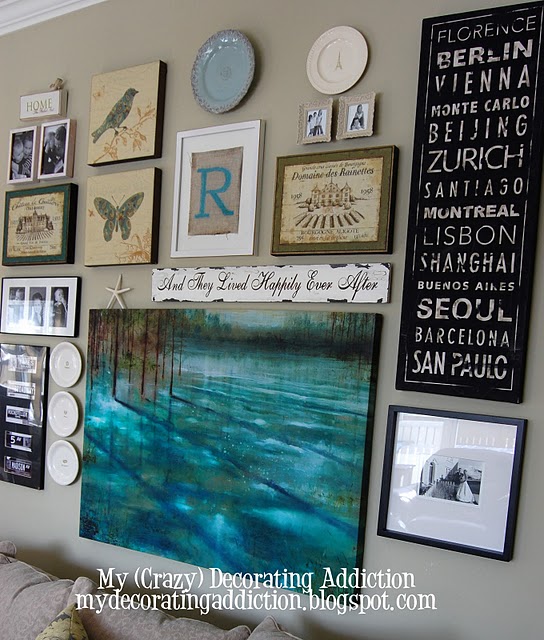
And, after a few other iterations, here’s where it stands today…
After some hard negotiation with pieces that were quite happy to stay put, I found a new arrangement that would accommodate the new ‘subway’ city name piece.
Sticking with the travel ‘theme’, the new piece also inspired me to pull this one in from another room (see right).
It’s a collection of black & white New York City street sign photos that I bought off a street vendor in NYC a couple of years ago. I think it balances out the city ‘subway’ art really nicely.
Also, I love effect that the hit of black from both these new pieces gives the gallery wall. I really liked the wall before, but the softness was feeling a little on the insipid side.You can always count on black to bring strength and sharpness, especially on something like a gallery wall.
You might notice a couple of other small changes as well – like the new column of cream plates, and the little starfish. A gallery wall is like a puzzle, and as with most decorating projects, once you move one item, it sets of a chain reaction, and before you know it, you’re up to your eyeballs again in plates, and pictures and 3MCommand strips!
I have promised myself NO MORE TWEAKING for a least a couple of months. It’s just way too much work!
But it was all worth it to incorporate my new ‘subway’ style canvas which, at $25, just happens to be my… Best Find Ever!
I’m off the enjoy a Friday night BBQed steak and glass of red wine.
Have a happy weekend!
PS. I am sharing my gallery wall at Melissa’s Gallery Wall Party at The Inspired Room.
