This post was most recently updated on September 23rd, 2019
This year, I decided to decorate my Halloween mantel entirely without the colour orange. I had lots of orange in my Fall mantel, and it got tired – really quickly. The warm colours of Fall are beautiful, but they don’t do much for my home’s decor which is mostly cool tones. So instead of going the traditional route, I decided on a simple black-white palette with a bright pop of purple. I got a little carried away, and it ended up a lot more purple than b&w! Because my kids are still quite young, I went for a fun and whimsical feeling, rather than a scary one;that’s why you’ll notice lots of polka dots and glitter!


It’s amazing what you can find at the dollar store!
That great little sign “The Witch is In” came from there…which saved me time making one!


I also found that great hologram banner there. I dressed it up a little by adding a roll of polka dot ribbon.


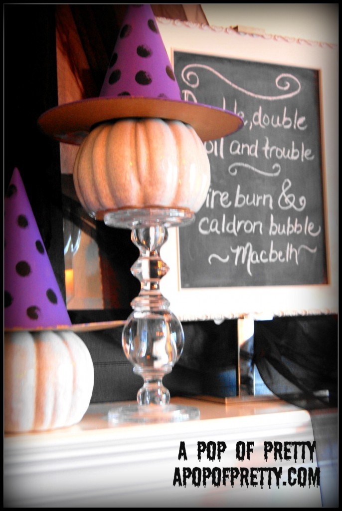
Those cute witches’ hats were just the plain cardboard ones from Michael’s. I painted them with Martha Stewart’s new craft paint line – the colour is called Purple Yam. It’s so pretty.


The chalkboard has been around for awhile now. You might have seen it on past mantels. I LOVE changing up the messages by season. This time around, for Halloween, I used a Macbeth quote: “double, double toil and trouble..”


The witch’s ‘brew’ was especially fun to create. Most of the sprigs were borrowed from my Christmas stuff (!). I have a battery-operated candle in there, so at night it has an eerie glow.
(Bwwaaaaaa-hahaha-ha)


So have you gotten into the Halloween decorating spirit this year?
Do you decorate your mantel for Halloween, or do you think I’m completely off my rocker, lol?!?
~Kerri 😉
I’m linking up to Beth’s mantel party at Home Stories A2Z!


and at the CSI Project’s Halloween Extravaganza!
![]()

and at