This post was most recently updated on September 23rd, 2019
Sectional sofas. It seems that in the world of decorating and design, you either love ’em or hate ’em! Perhaps that’s because decorating with a sectional can be a design dilemma. But say what you will about their aesthetic non-appeal, sectionals have their advantages.
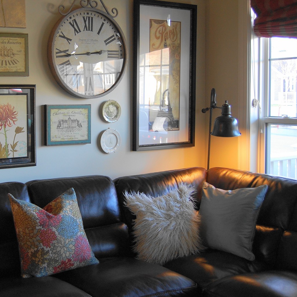
Back in the Fall, when our 13-year old sofa set could no longer withstand the antics of our 3-year old boys, we gave in and purchased a big leather sectional for our upstairs family room.
Not to mention, that chaise lounge thingy (is that what you call it?) on the corner is super comfortable! So we seem to use the room more often as as a family now too. Here’s a quick pic I took before the holidays when I was still trying to figure out that wall behind the sectional. I’m still working on getting it ‘right’! More photos soon! ===>
I have to admit, decorating with a sectional is indeed a little tricky! They’re huge and awkward. It’s like decorating around an elephant. So I went looking for some inspiration on Houzz, Pinterest and blogs.
I found that all of the rooms with sectionals that I liked the best had two things in common:
Big art or gallery walls.
When it comes to sectionals, big art and gallery walls seem to serve two purposes. First, they help to visually balance out the hugeness of a sectional, bringing everything into harmony. Because you can create a gallery wall to any dimensions you like, its a great solution for taming a sectional. Secondly, an eclectic mix of art helps add a layer of visual interest to the room that distracts from a sectional’s “I’m here and you can’t ignore me” kinda attitude.
Toss pillows.
Without toss pillows, a sectional can feel like a big expanse of endless sofa. Toss pillows in different colors and patterns help to give it some life. They also help to physically define the seating arrangement a little better, and generally make a sectional feel cozy and intimate, rather than cold.
Five fab examples…
Here’s five fab inspiration rooms that use both gallery walls and toss pillows to tame a sectional sofa!
No discussion about sectional and gallery walls would be complete without mentioning Nester’s living room. She’s the official gallery wall whisperer. I’m absolutely mad for this wall, and I seem to love it even more every time she changes it! Just gorg. Source and photo credits to Nester at Nesting Place
So do you have a sectional? Do you have any decorating tips?
I’m hoping to finally figure out that wall behind our sectional soon.
Until next time,
