
This post was most recently updated on January 18th, 2022
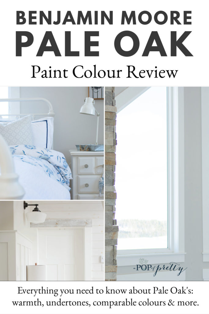
In this article: Benjamin Moore Pale Oak paint color review! I give all my thoughts on OC-20, a neutral paint that I’ve used throughout my home. It is a paint colour that rivals the ever-popular neutrals Edgecomb Grey and Classic Gray. Are you wondering about its depth, warmth, undertones, and more? This article covers everything you need to know about Pale Oak.
Benjamin Moore Pale Oak is one of my all time favourite paint colours. Are you wondering if it’s worth trying in your spaces? Or just on the hunt for a nice neutral paint colour with a bit more warmth than white? Well, you’re in luck. One of the top questions I get asked over on my Pop of Pretty Instagram account is the paint colour we used in our cottage. And, spoiler alert: it’s Benjamin Moore Pale Oak.

A lot of people wonder about Benjamin Moore Pale Oak vs Edgecomb Gray and also vs Classic Gray. I’ve used both those neutrals in our city home, so I have a good idea how they compare to Pale Oak. Some of you have also asked about the undertones, or is Pale Oak a griege. I’ll cover all of these questions and more in this article.
Benjamin Moore Pale Oak: Quiet Restraint
I love how Benjamin Moore describes this colour. Sometimes paint descriptions (and even color chips) don’t ring true when you try them on your walls. But this one about Benjamin Moore Pale Oak is exactly right. They say that this “beautiful neutral is graceful and elegant, conveying a sense of style and quiet restraint.”
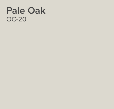
I think that quiet restraint is a perfect description of Benjamin Moore Pale Oak properties. I have this colour throughout the main floor of our cottage so I can attest that it is a serene neutral that walks the line between a creamy off white and a light warm grey. It also feels more modern than the popular taupes and grieges of the past decade. And don’t be put off by this paint chip. I find these are always a little darker on the Benjamin Moore Web site than in real life.

Why I Chose Benjamin Moore Pale Oak
I landed on Benjamin Moore Pale Oak through pure luck. Somebody recommended it to me which saved me the hassle of deciding among so many neutral paint colours. I wanted a neutral with just the slightest hint of warm grey to coordinate with our mostly white interior.
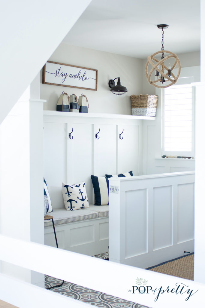
Our cottage has a lot of of moulding, including whitewashed shiplap walls and white board and batten walls. All of this white moulding makes the space feel clean and airy. Therefore, on the walls that were drywalled, I wanted a paint colour that added warmth and depth, but still kept the interior feeling bright.

As soon as I tried Benjamin Moore Pale Oak in the space, I loved it. It has a perfect amount of colour. Not enough to make it a moody or dreary griege. And, not too little to make it feel like just another white.
Is Benjamin Moore Pale Oak a Griege?
Is Benjamin Moore Pale Oak a griege? In case you aren’t familiar with the term, ‘grieg’e is a colour that reads as a gray as well as a beige. Griege paint colours have become extremely popular over the past few years as warm, neutral go-tos. Some popular ones I’ve used in my homes include Benjamin Moore Revere Pewter, Edgecomb Gray, and Classic Gray. In my opinion, Benjamin Moore Pale Oak isn’t really a true griege like those deeper colours. It does read both beige-y and greyish but it feels much lighter and airier.
Lighting Make a Difference
Exactly how light Benjamin Moore pale Oak will appear in your space all depends on lighting! It will definitely read a deeper shade if a room doesn’t have a lot of natural light. While our home does have a tonne of windows, we have also used this colour in rooms with less light. And, it does look darker on walls that don’t get as much light which is normal for all paint colours.

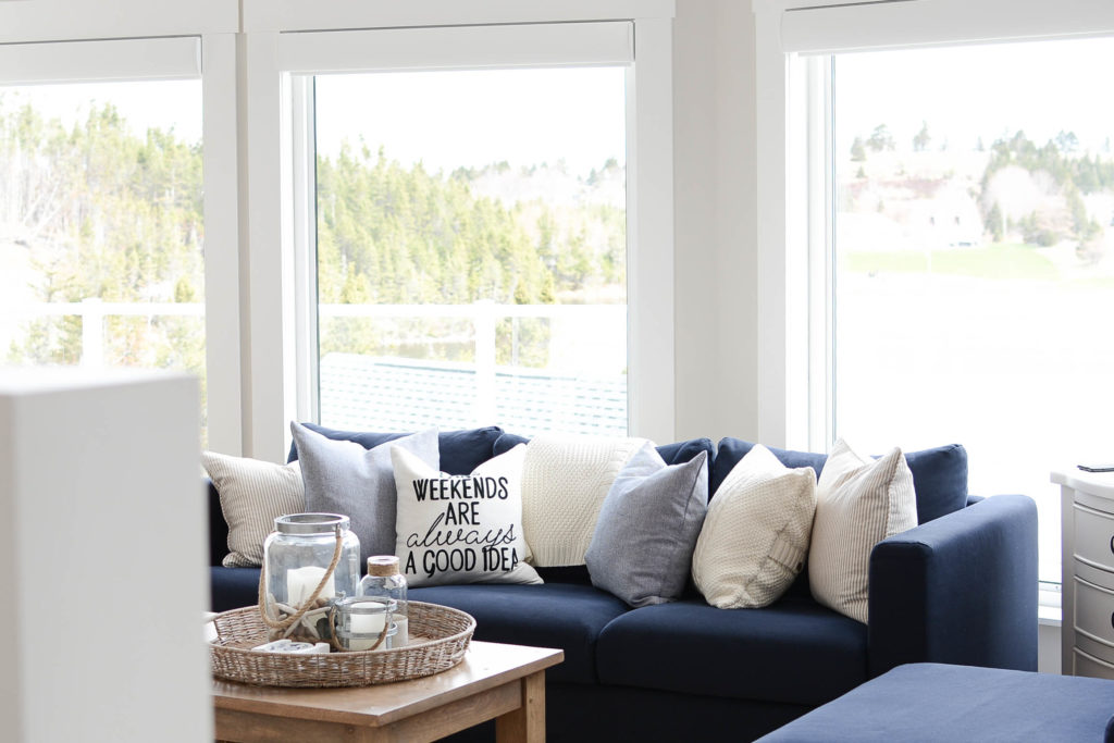
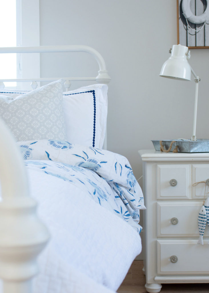
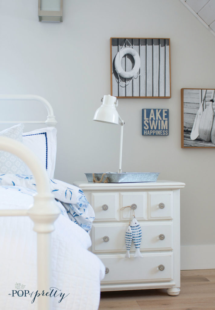
For example, in the first photo below, there is a large 2-story window directly across the room. So this wall gets a lot of natural light. That’s why it feels more like a warm white than a griege.
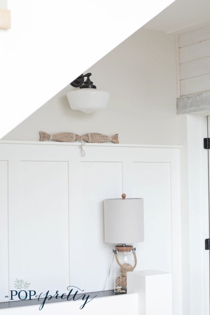
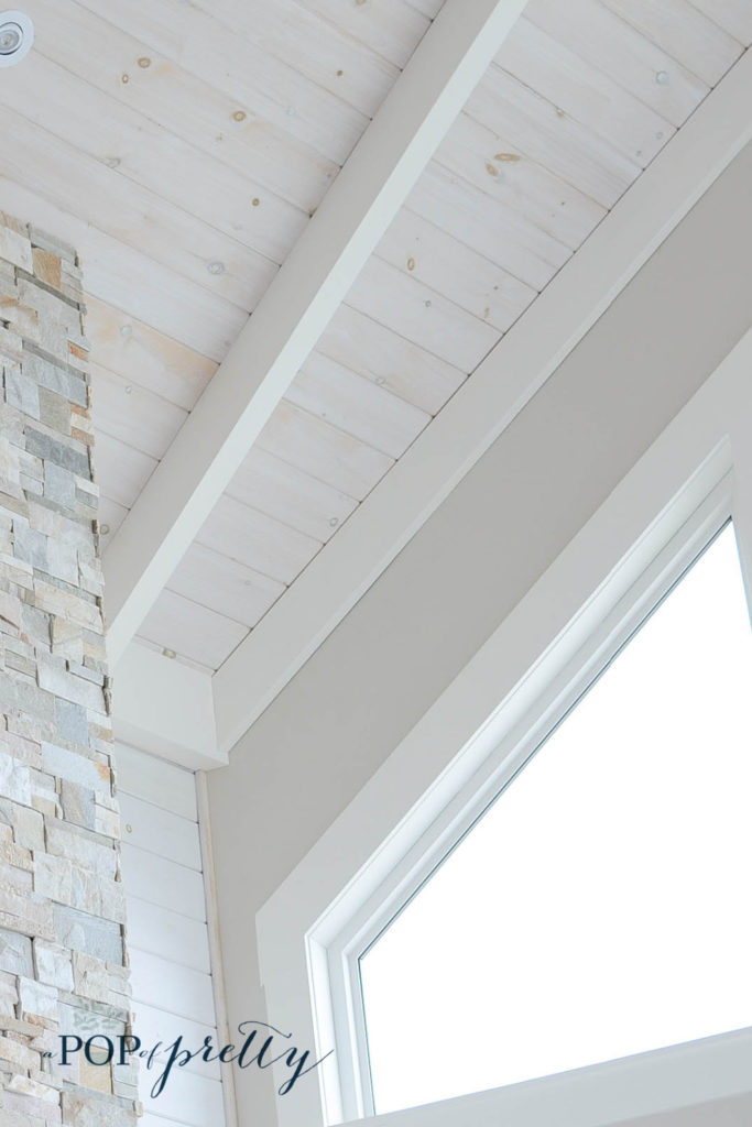
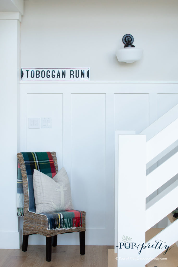
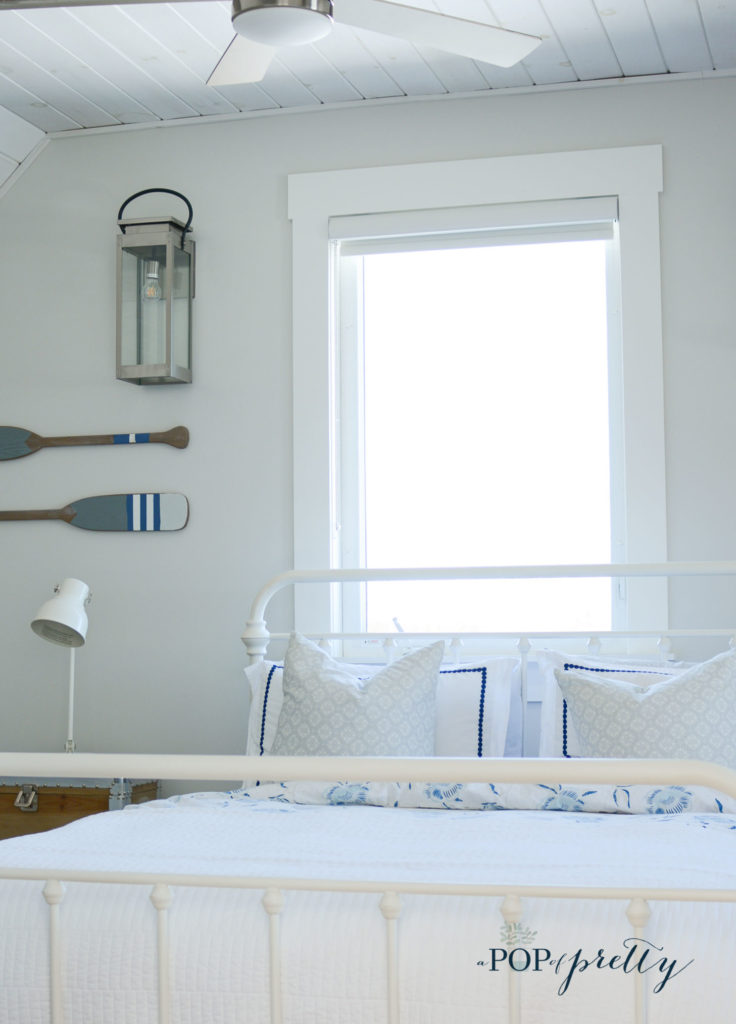
However, in this second photo, you’ll see how it reads on that window wall. It appears a little more dramatic because it is not receiving as much natural light.

Benjamin Moore Pale Oak vs. Edgecomb Gray
A lot of people also ask about Benjamin Moore Pale Oak vs Edgecomb Gray, and what’s the difference between these very similar paint colours. I’ve used both these colours extensively, so I can offer some insight on this. You can see my review of Benjamin Moore Edgecomb Gray here: Edgecomb Gray: Why I Love It.


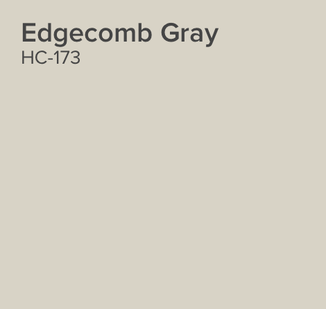
So what’s the difference between the two? These two Benjamin Moore colours are very close, but Benjamin Moore Pale Oak is definitely the lighter and airier choice. I have Edgecomb Gray on the walls of my living room in our city home and it feels earthier and deeper than Pale Oak. This makes sense given that the LRV (or Light Reflectance Value) of Pale Oak is 69.89 while Edgecomb Gray’s os 63.88. (The higher the LRV, the lighter a paint colour is.) Pale Oak also feels slightly cooler than Edgecomb Gray which has a lot of warmth.
How Does Benjamin Pale Oak Compare to Classic Gray?
Some readers also ask how Benjamin Moore Pale Oak compares to BM Classic Gray. I have Classic Gray on my bedroom walls in our city home, and there’s a slight difference between the two. Classic Gray is a bit lighter than Pale Oak (with an LRV of 74.78). But, Classic Gray has slightly greener undertones, so it reads more as a beige than a grey in my space. Isn’t it funny how paint names can be so deceiving?

Classic Gray is definitely a tranquil neutral, however, in my opinion, it just doesn’t have the same visual interest as Pale Oak. Personally, I prefer Benjamin Moore Pale Oak over both Edgecomb Gray and Classic Gray. Don’t get me wrong, all three are super neutral choices. But, for me, Pale Oak just feels more modern than the others.
Benjamin Moore Pale Oak Undertones
Are you wondering about Benjamin Moore Pale Oak undertones? Just like any paint colour, undertones are something you need to consider. I’ve read some reviews online which discuss possible peachy-pink or purple-ish undertones. While I’m not discounting those reviews, I’ve never seen this myself. We’ve used it in almost every room in our cottage facing different directions, and with all kinds of lighting conditions. Yet, I can honestly say that I’ve never noticed anything other than a pure neutral. (And, I’m really picky about shifting colours.) I’ve only ever seen this colour change in terms of its depth (i.e., lighter or darker) and never by hue.

What I Love Most About It
The thing I love most about Benjamin Moore Pale Oak is how lovely it plays with other colours. It looks great with lots of white trim work, and I especially love how it looks with blue accents.
It’s definitely a super versatile, multi-tasking paint colour. It is light enough to help create an airy vibe, but warm enough to give a space some interest. And, it has just enough depth to make your whites pop a little brighter.

Would I recommend it?
Yes, I love Benjamin Moore Pale Oak and would certainly recommend it if you are looking for a light, warm neutral. However, I ALWAYS suggest sampling a new paint colour in your own space before committing. That’s because paint colours will always read a little differently depending on the amount of natural light and the direction your room is facing. Further, it is impossible to represent paint colours with 100% certainty on a computer screen. So, try it out and let me know what you decide! I’d love to know how Pale Oak looks in your space.
Here are a few other paint color related articles you might like:
Prettiest Gray Paint Color (Maybe Ever!): Behr Curio
Until next time,
K.