This post was most recently updated on September 23rd, 2019
It turns out that I wasn’t finished with my gallery wall in my living room after all.
It also turns out that this gallery wall is just one more thing in my life that is going to make me crazy!
When I went in search for gallery wall inspiration, the examples I found all seemed so, well, perfectly imperfect. For me, their ‘perfection’ came from being imperfect. It didn’t matter that the distance between each element was inconsistent, or that something was a little off-center.
So why is that I keep asking myself…Is that picture centered? Should it be? Is that picture level? (I swear it was yesterday!) Should I fill that empty spot? Is it too crowded? Yes, each and every time I sit in my living room, I stare blankly at the wall and think…hmmm…that needs a little adjusting here…and that could be better there!
But despite those little irritations, I really enjoy this wall. I realize that gallery walls are not for everybody, but they are high on my list of favorite things. And, this one has really grown on me over the past month.
Here’s where I started out…
Here’s where I was with it the last time I posted about it:
At that time, I really felt that something was off.
The more time I spent with it, the more I determined what needed to change.
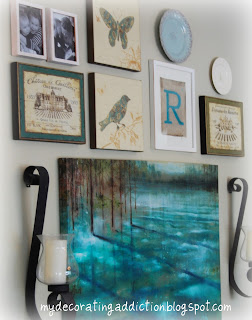
I determined that the sconces needed to go. Because the large canvas was centered between them, it felt like everything else was just floating on top. It felt like two separate wall groupings, rather than a cohesive ‘gallery’.
I also felt like it needed more personal relevance and personality. It needed to be meaningful, not just a bunch of pretty things. So I added more of my favorite photos, as well as my favorite rustic sign and a little chalkboard. It now incorporates so many of the things I love – my favorite photos of my babies and my niece/nephew, a bird and a butterfly, french wine labels, pretty plates (one with the Eiffel tower), a chippy vintage sign, and a chalkboard.
And, tada, here’s how it looks now…
And here’s a closer look at some of the elements I used…
I know it will probably be tweaked again later, but for now, it makes me happy. And isn’t that what decorating is all about? 🙂
So how do you feel about gallery walls? Love em or leave em?
PS. I’m sharing this at


Stunning configuration! It has just the right proportion of color, text and shape so that it’s not overpowering. May I ask, where did you find, or who is the artist of the large canvas print? If you would let me know I would be VERY grateful!!
I was looking for that too…..I just found it in Michaels….its called Water Trees by Gregory Williams….I got the poster print for $17 after a 50% off coupon….good luck.!
Oh–so much better! Wow. Love this. To bits. I liked the 3-D element of the sconces, but this is SO much better. Everything is integrated, now. Love how your “detail” pic kind of mirrors your gallery arrangement.
Ooooh I LOVE your gallery wall!!
ps – I'm your newest follower 🙂
I know what you mean! My gallery wall has been a work of art for several weeks now. I finally finished it yesterday morning. It's funny..you know when it needs work and you know when it's done – you're happy with it. I'm your newest follower!
I love it! I agree that something seemed a little off last time. I am finding sometimes you have to live with it awhile to figure out just what that something is. And isn't home decor always a work in progress? Great job!
Jeanette
I love <3 love gallery walls. I need more wall space so I can do more of them. I really like that painting in yours. The mix of items is great.
Looks great! Love gallery walls but I'm a "teaker" too. My walls looks like swiss cheese and my hubby thinks I'm crazy 🙂 Laurel
It is gorgeous. I love the canvas. Is it a painting or a photo that has been canvased?
I love gallery walls.
LOVE THE NEW ARRANGEMENT. LOOKS GREAT
I love the new look of the gallery wall! I hate most of my walls right now since they are mostly white and bare. Stopping by from the Weekend Wrap Up