This post was most recently updated on January 18th, 2022
In this article: Shelf styling tips for a clean, collected look. Styling a shelf can be frustrating when you’ve fiddled and fussed, but your bookshelf still looks like a hot mess. (I’ve been there!) So, today, I’m sharing 5 simple shelf styling tips that I’ve learned through years of trial and error. With these super do-able tricks, styling a shelf that looks collected, not cluttered, is easier than you think.
Shelf styling. I bet you either love it or hate it. And, even if you love tinkering with decor like me, styling a shelf can still be frustrating. I’ve been there. You aim for that ‘effortlessly styled’ look, but end up with a hot mess of trinkets and thingamabobs. Well, after trial and error over the years, I’ve discovered a simple shelf styling formula that works for me. So, today, I’m sharing 5 easy shelf styling tips for creating pretty shelves that look perfectly collected and uncluttered.
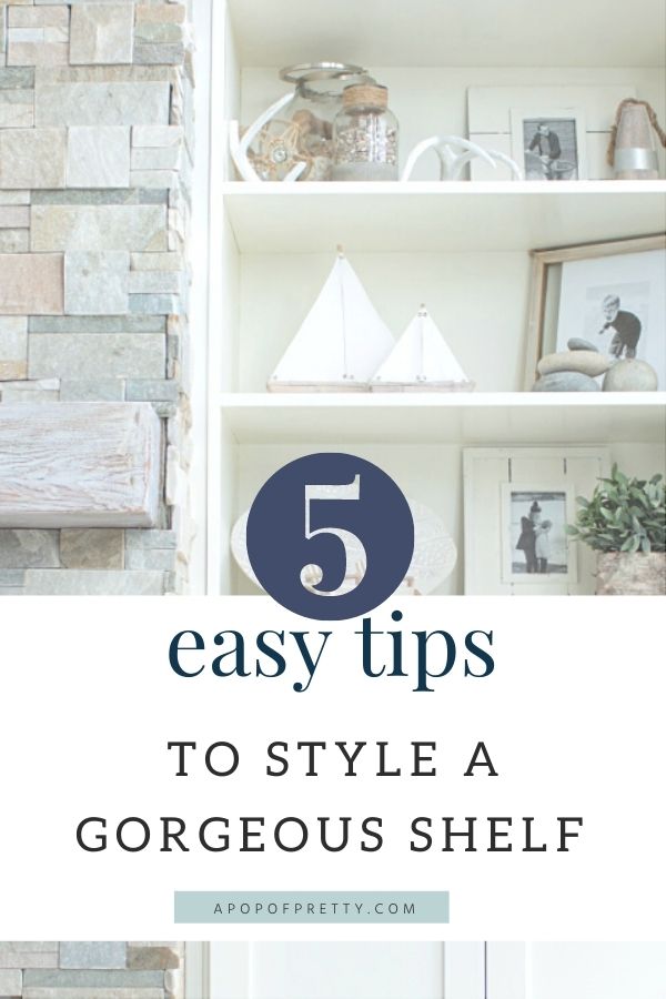
Shelf Styling Tip #1: Create Groupings
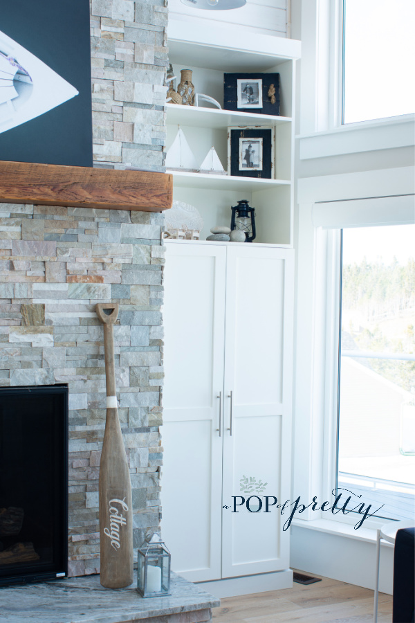
First, when you are styling a shelf, group your decor objects. This helps reduce the visual clutter because the eye is drawn to the groupings, not all the decor elements. I typically use groupings of two decor items (the sailboats in the photo below) or three (the beach rocks). But, even a larger grouping works well if the objects are similar in colour of texture. As an example, take a look at the jute-wrapped bottles items and white antlers on the top shelf below. There are actually 5 items in this grouping. If these were spread out on this shelf, it would look messy and cluttered. But, as a grouping, the look is streamlined.
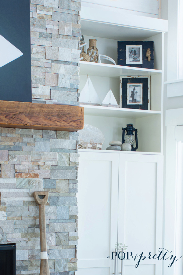
When forming a grouping, just try to find decor items that work together visually. They could be similar or complementary in colour, shape, material or texture. There’s no hard and fast rules on this. Once you’ve decided on your decor items, arrange them so that the grouping has some depth. What I mean is don’t place everything next to each other. Instead, play around with the items, placing some towards the front and back. Another thing I love to do is to vary the number of groupings on different shelves. In other words, on some shelves, I use just a couple of groupings, while on others, I use more. This helps to create more visual interest in your shelf styling.
Tip #2: Tame the Colour Scheme
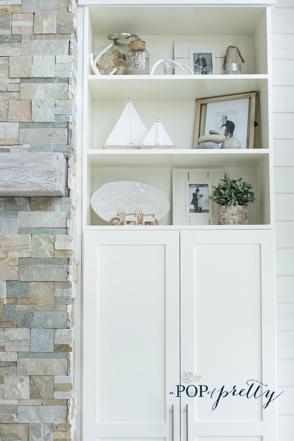
Shelf styling works best when you stick with the colour palette of your room. Or, better still, use neutral decor items. Your shelf collection should blend with the space, not compete for attention. Adding too much colour, or colour that doesn’t work with the space, will be a visual distraction. By contrast, if you tame the colours used in your shelf decor, you’ll get better results. For example, in this article, I’m sharing photos of the same shelves, styled two ways. One look (above) has hits of navy blue and the other look (below) uses all neutral decor. Yet, both work equally well at complementing, not distracting from, our coastal-inspired space. That’s because our space is decorated primarily with blue and white.
Bonus Tip: Adding Texture & Warmth
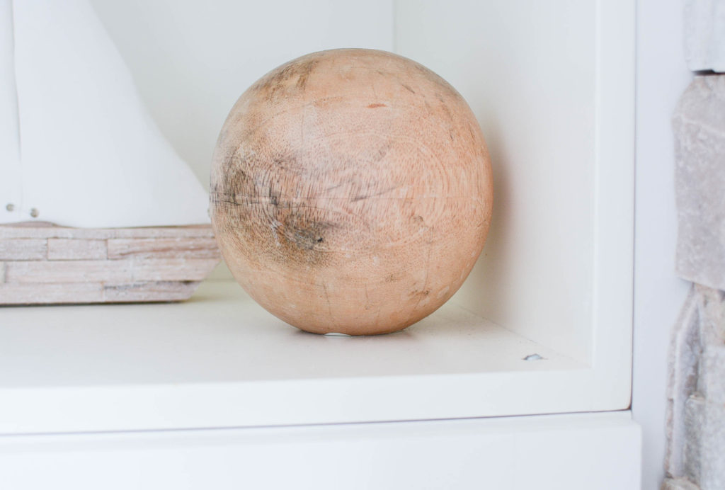
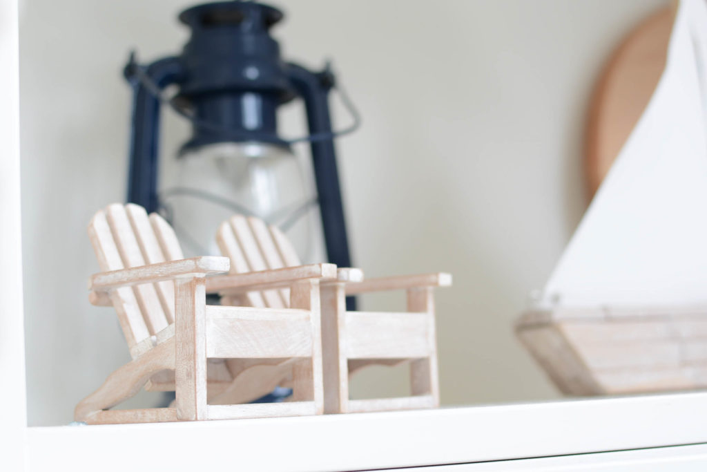
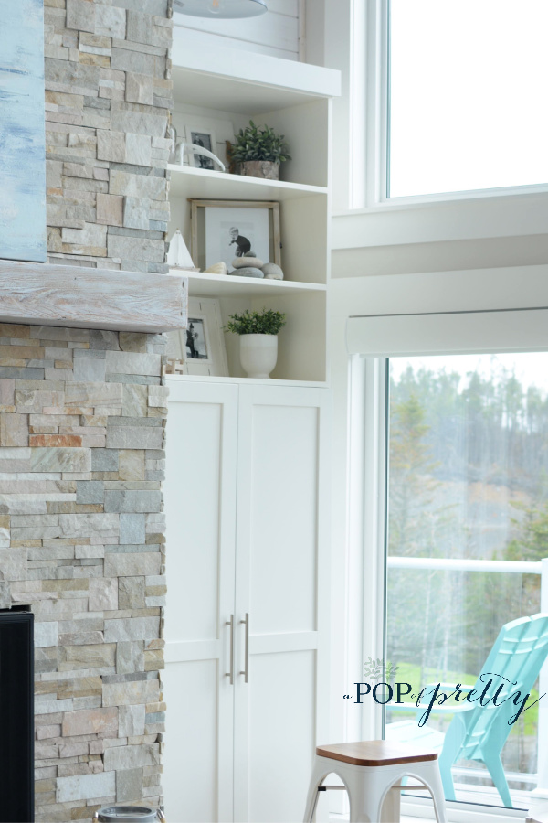
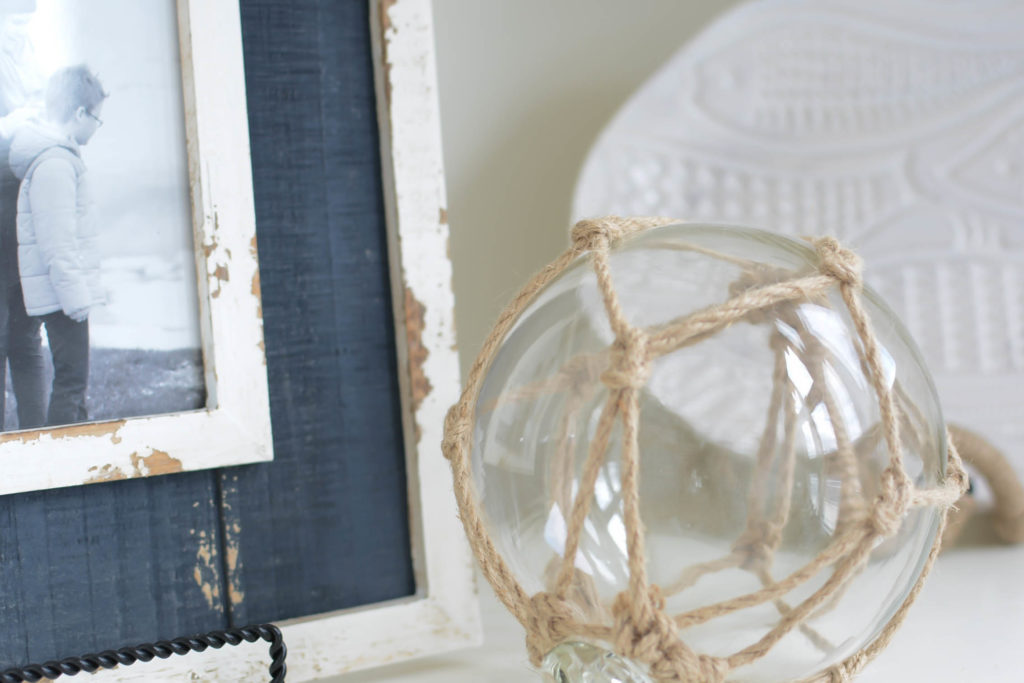
OK, I know what you’re thinking. Neutral is boring. But, I promise you, neutral shelf decor can actually be even more warm and inviting! Just be sure to add items that have natural texture like rattan baskets or pops of greenery. For example, take a look at the jute wrapped bottle and shells in the jar in the photo above. They help to make the look more cozy. Or, add warmth in your neutral shelf styling with muted or whitewashed wood tones, like the wooden ball or mini adirondak chairs below.
Bonus Tip: Using Photos
Another way I love to tame the colours when I’m styling a shelf is to use black & white photographs. I’m super sentimental, and I love to decorate with family pictures. However, sometimes coloured ones can create visual clutter when paired with quieter decor. But, there’s an easy fix. Just print your favourite ones in black and white or sepia tone instead! In addition, placing your photos in a cohesive set of frames will create a neat, unified look on your bookshelf.
Tip #3: Vary Height of Objects
Even with a tamed colour scheme, your shelf styling can still have lots of visual interest if you vary the height of your decor objects. This helps to create movement and rhythm in your shelf styling design. Using objects of different heights encourages the eye to wander to take in the entire view of your bookshelves, rather than to rest in one spot.
Try not to palce items with the same height next to one another. Instead, change things up to create more interest. You can use stacked books or pedestals to give some items more height. And, this might sound weird, but, when deciding where to place items, try and imagine a triangular shape. The use of visual ‘triangles’ in design is actually a tried and true, eye-pleasing trick. There are lots of great resources out there which describe this design technique, such as this one: Visual Triangles: An Interior Designer’s Best Kept Secret.
Shelf Styling Tip #4: Repetition
Repeating items on different shelves in your bookshelf helps create a sense of unity and consistency. For example, we have the same set of open shelves on each side of our fireplace. To achieve visual balance, I always repeat a few of the decor items on each side. You can see the left-hand side of the fireplace in the photo below. Note the sailboats, the greenery, the beach rocks, and the framed black and white photo of one of my boys at the beach.
Now, take a look at the right hand bookshelf below. You’ll see that I’ve repeated some of the same items, including a nearly identical beach photo of my other twin boy. But, to keep things from looking too rigid, I’ve placed some of the matching items in different spots on each side. Even if you are only styling one bookcase, you can still use repetition among the different shelves create the same kind of visual harmony.
Tip #5 for Styling a Shelf: Balance
My final tip for styling shelves that look collected and uncluttered is about creating balance. As just discussed, repetition of decor items is one technique for creating harmonious balance in your shelf styling. But, equally important is the placement of your decor items.
There is no set rules for achieving balance when styling a shelf. Symmetry is always a go-to, but, admittedly, it can feel a little rigid. Play around with your shelf decor. Then step back to discover where your eye is naturally pulled. If the focal points aren’t evenly distributed, shift some things around until it feels harmonious.
The Secret of Visual Weight
You can create balance in your bookshelves by evenly distributing decor items with the same ‘visual weight’. To explain, your decor items will all have different ‘visual weights’. An item that has visual weight is one that the naturally eye is drawn to. Or, in other words, it creates a focal point. Perhaps it is more colourful or textured than the other items, or its sheer size just gives it more presence.
Whatever the case, any decor items that the eye is naturally drawn to should be placed evenly throughout your bookshelf. For argument’s sake, let’s say you are are decorating a 5-shelf bookcase with a bunch of decor items, three of which are visually-dominant. You might place one visually-heavy item to the right of the first and last shelves, and one dominant item at the left of the middle shelf.
So perhaps you are wondering why I placed all the visually dominant decor items to the right of the shelves in the above photo. Well, this is because this bookshelf is actually one of two built-ins on each side of the fireplace. Here, my goal was to create balance between two bookcases, which I’ll discuss more below. But, if I was decorating just this one, I would aim to achieve visual balance between these shelves. So, I might want to have a weightier item where the sail boats are, so that the overall look doesn’t feel as lop-sided. On the second shelf, I might switch the sailboats and the navy frame around so that all the weight wasn’t on one side.
Creating Balance Between Two Built-in Bookcases
If you are decorating two built-in bookcases like me, for example, one on each side of a fireplace, this principle of balance is just as easy to achieve. If you take a peek at the video below, you’ll notice that the navy blue items are the weightiest. I placed these visually-dominat items at the outer edge of the shelves on each side of the fireplace. This helped to create a more streamlined look in my shelf styling than placing them haphazardly.
Shelf Decor Ideas
OK, so now you have 5 easy tips for taking your shelf styling game to the next level. But, what kind of home decor should you use on your to decorate your shelf? Before buying anything new, ‘shop your house’ for items that might work, like books, baskets, candle sticks, lanterns, family photos, glass jars and vases, greenery and florals, and even small art pieces. But, if you are still stuck for shelf decor ideas, here are a few things I LOVE (Note: contains commissionable affiliate links):
I hope you can use these 5 easy tips for decorating a bookshelf to up your shelf styling game. In the meantime, you might also enjoy these other home decorating posts:
DIY Cane Furniture (Home Decor Trend)
Curtain Hack Tutorial (No Sew)
Until next time,
K.

