This post was most recently updated on January 1st, 2020There was a time in the not-so-distant past when I would…
Read More
Curtain Hack Tutorial (No Sew): Grommet Curtains to Pleated Drapes
This post was most recently updated on November 11th, 2020In this article: You’ll learn a super-simple, no sew curtain hack…
Read More
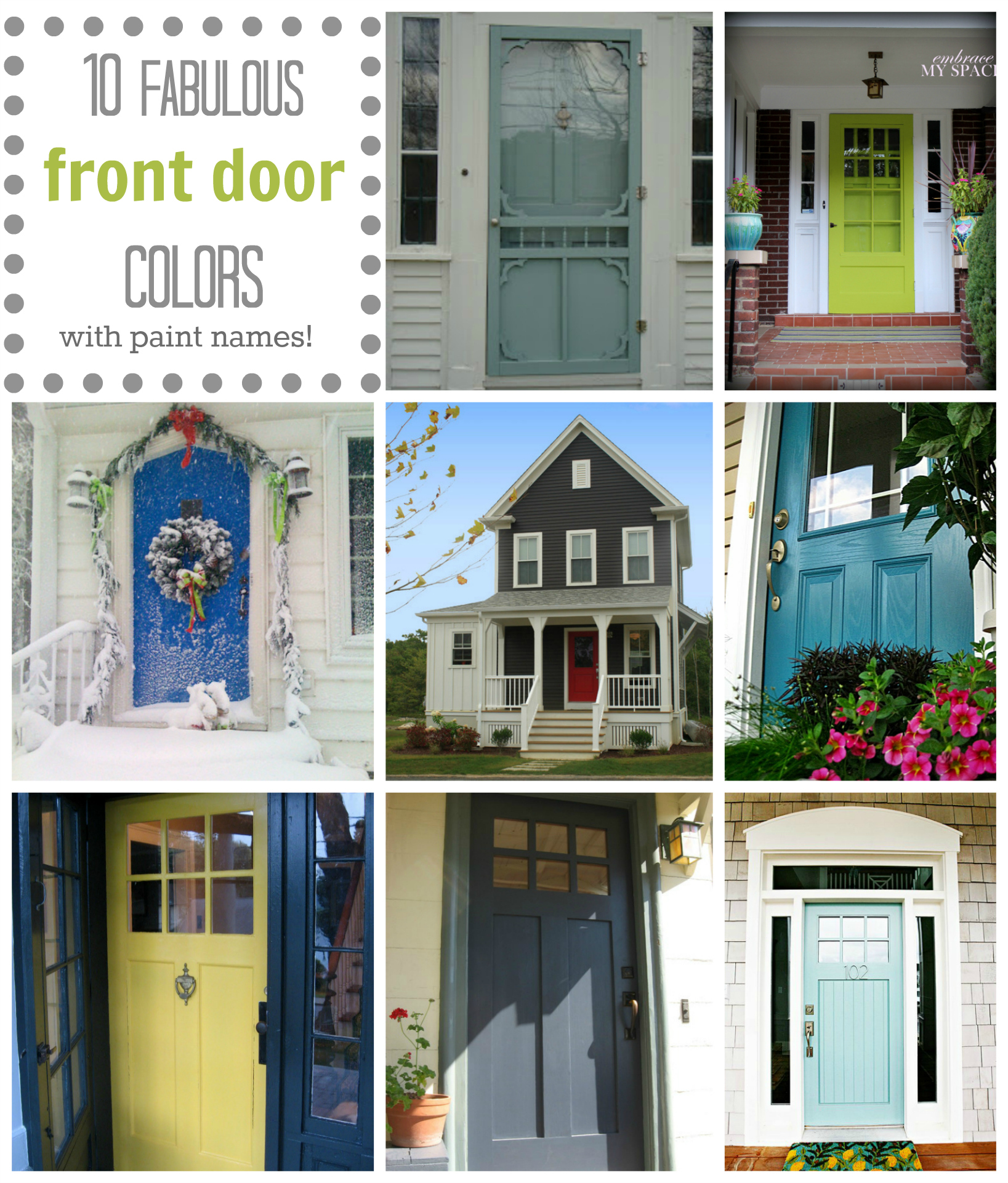
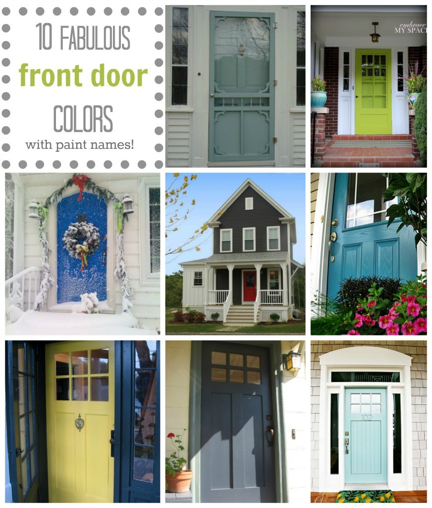
Front Door Color: 10 Fabulous Front Door Colors (& their paint names!)
The snow is gone, the sun is out, the temperatures are rising…dare I say it’s the season for front door painting? (Can I get a booyah?)
I’m a sucker for fab front door colors.
There’s nothing that provides easier curb appeal than a pop of fun color on a door. Trying a bright or fun color on your front door can be scary, but I love how this web site about exterior color explains the fact that colors have visual ‘weight’, and that a powerful color in a small dose can visually balance an expanse of neutral house siding.
I also thought this analogy from the same site was great: “Remember that your house most likely will be viewed from the street which may mean 60 feet or more from the curb. It’s like the actress with her stage makeup, positively frightening, but she has to be seen by the person in the very back row of the theater.”
.
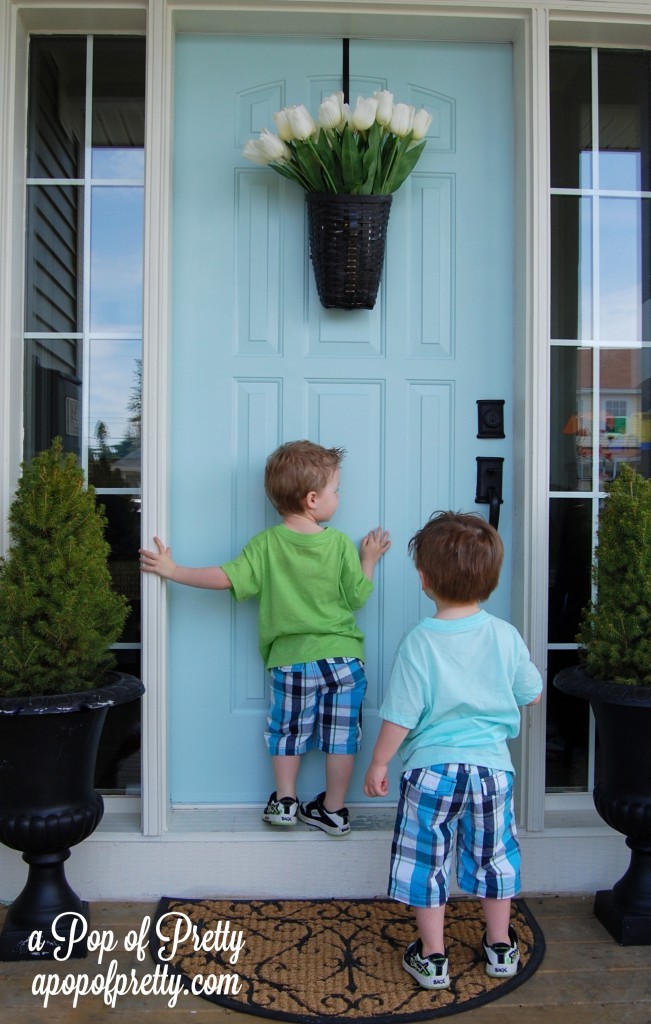
Last year at about this time, I took the plunge and painted the front door on our house (which has cypress green siding) from a safe and traditional red, to a more unexpected light turquoise.
My Front Door Color:
Martha Stewart Artesian Well
Mixed as Behr paint + primer
If you’re in the market for new front door colors like I was, you’ve probably searched for inspiration on Google, Pinterest and more. (It feels so much safer, doesn’t it?!?) I found many pretty front doors, but found it frustrating that the exact paint color chip number couldn’t be traced for many of them.
So, for any of you lovely readers who might be considering changing your front door color this spring, I’ve rounded up 10 of my favorite ones…but I’ve only included doors for which I could trace the paint color with a fair amount of certainty. You’ll notice that most of them are Benjamin Moore paint colors – I tried to stick with a brand that’s most widely available.
How to Tame an Art Wall {Gallery Frames}
If you know me, then you know things rarely stay the same for long around here!
.
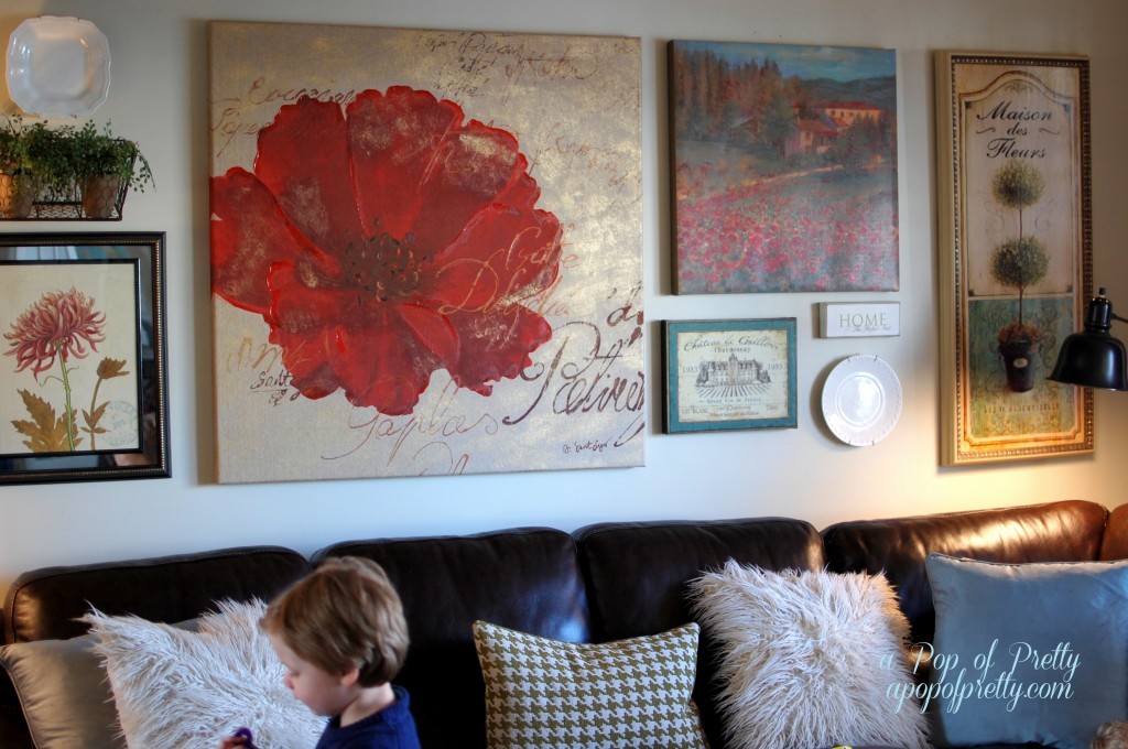
Like, for instance this gallery wall over our sectional sofa that I talked about a little while back. Here’s how it looked back then…
.
.
.
I was happy enough with how the gallery wall turned out, but after living with it little awhile, I decided it was a little busier than I had planned. I think that’s because of the saturated colors (the reds and teals) AND the fussy lines in all of the pieces (i.e., the florals). I felt like it needed to be tamed! Plus, I had really wanted to incorporate some family photographs to make it feel more personal. I’ve experimented quite a bit with gallery wall groupings in our home, and photos are definitely the key to bringing a collection to life. (For some other gallery wall tips, click here.)
.
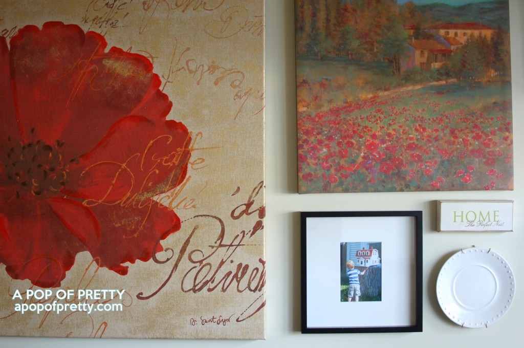
So a couple of days ago, I decided to remove a few of the ‘fussier’ pieces (the basket, the mirrored botanical print, and the wine label art), and replace them with some simple modern gallery frames. I’ve always loved, loved, loved photos in gallery frames, but was reluctant to use them on this particular art wall because of the more traditional style of the painted canvases.
.
…
I was wrong! I immediately loved the contrast between the clean lines of the gallery frame, and the more detailed canvases. The simplicity of the gallery frame (with its white matting) helped bring some much needed ‘quietness’ to the collection. READ MORE
I miss my Living Room Gallery Wall! (The great debate: Simplicity vs Eclectic/collected decor?)
This post was most recently updated on September 23rd, 2019Since Christmas, I’ve been on a bit of a quest to…
Read More
Slaying a Sacred Decorating Cow
This post was most recently updated on June 5th, 2011Step 1: Move furniture from Room A to Room B. Step…
Read More
