If you know me, then you know things rarely stay the same for long around here!
.
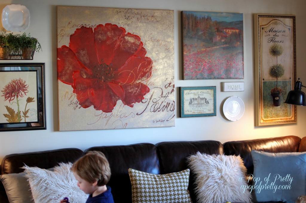
Like, for instance this gallery wall over our sectional sofa that I talked about a little while back. Here’s how it looked back then…
.
.
.
I was happy enough with how the gallery wall turned out, but after living with it little awhile, I decided it was a little busier than I had planned. I think that’s because of the saturated colors (the reds and teals) AND the fussy lines in all of the pieces (i.e., the florals). I felt like it needed to be tamed! Plus, I had really wanted to incorporate some family photographs to make it feel more personal. I’ve experimented quite a bit with gallery wall groupings in our home, and photos are definitely the key to bringing a collection to life. (For some other gallery wall tips, click here.)
.
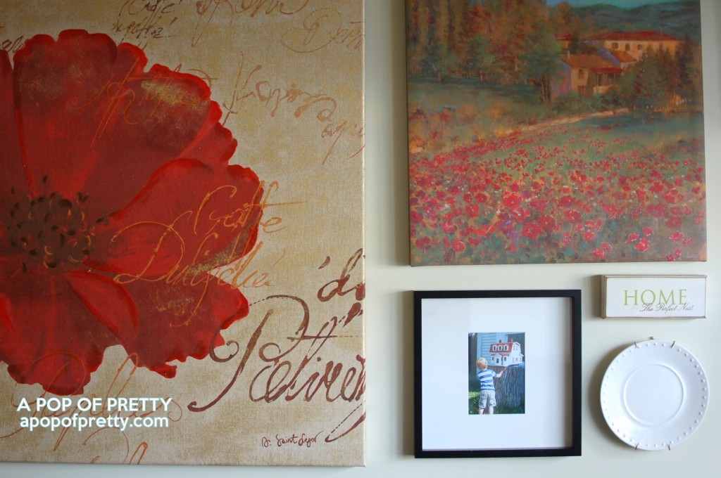
So a couple of days ago, I decided to remove a few of the ‘fussier’ pieces (the basket, the mirrored botanical print, and the wine label art), and replace them with some simple modern gallery frames. I’ve always loved, loved, loved photos in gallery frames, but was reluctant to use them on this particular art wall because of the more traditional style of the painted canvases.
.
…
I was wrong! I immediately loved the contrast between the clean lines of the gallery frame, and the more detailed canvases. The simplicity of the gallery frame (with its white matting) helped bring some much needed ‘quietness’ to the collection. READ MORE


