This post was most recently updated on September 23rd, 2019
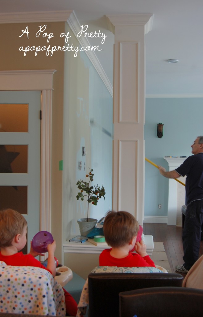
We painted our living room area with Benjamin Moore Woodlawn Blue this week. OK, so I use the term ‘WE’ loosely. I enrolled my dad. He’s a painter extraordinaire. Does taking photos of him painting walls while I sit and drink coffee count as ‘WE’, lol?
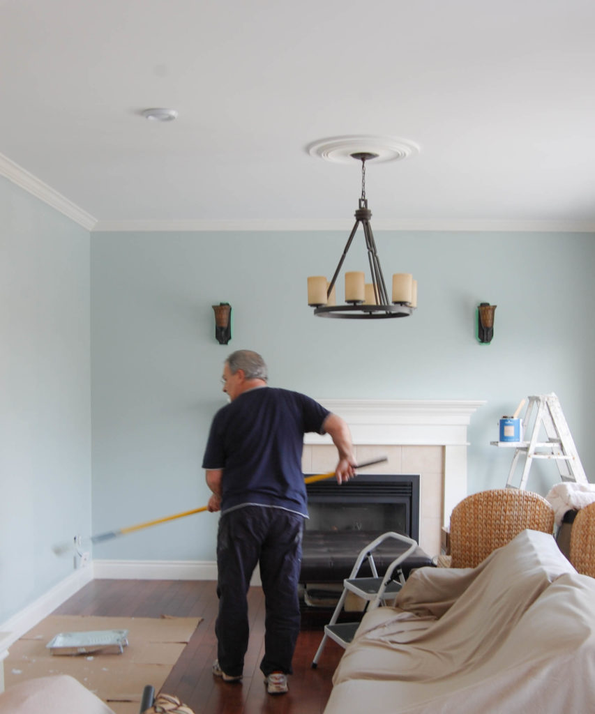
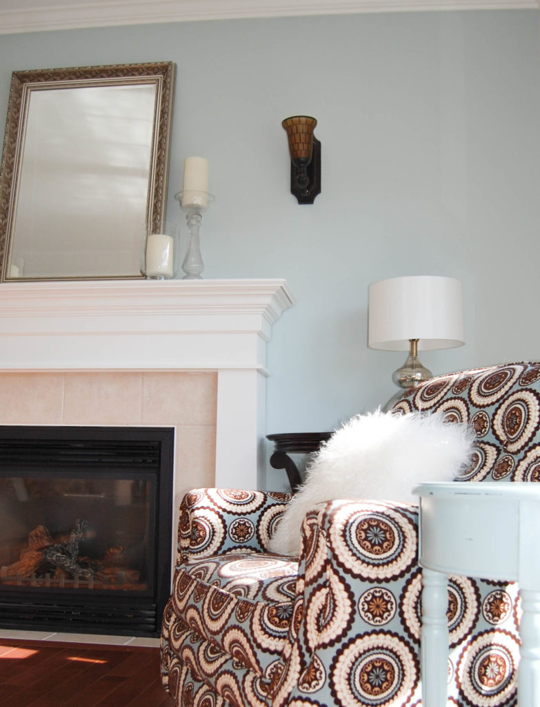
I’ve had a major crush on Woodlawn Blue (HC-147) by Benjamin Moore for awhile now. So, when we purchased new living room furniture last summer, I chose it with plans to incorporate Woodlawn Blue on the walls. Even with the first swipe, I knew I’d made a good choice.
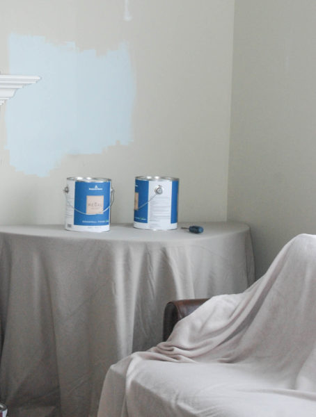
It’s been a few days now, and I can’t tell you how happy I am with Woodlawn Blue on the walls. A slight caution: it looks entirely different depending on the time of day. But that’s pretty much like any paint colour, right? In the morning, when this room gets a lot of light, Woodlawn Blue appears more light aqua, and in the evening, it’s more grey. But, I’m happy with all its different personalities!
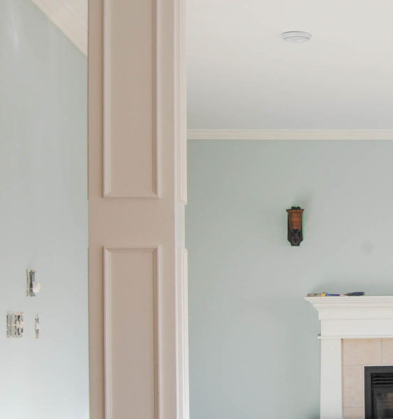
Woodlawn Blue looks amazing in any kind of light. It even makes our hardwood floors look like a deeper shade of brown than our original beige/green (SICO Kalahari Beige) walls did. The magical powers of paint!
Another bonus…the painting kept our boys entertained for a full hour yesterday. They adore their “Boppy” (the name all the grandkids call my dad), and I think that watching him ‘color the walls’ was fascinating. I’m just hoping that they don’t get the same idea, lol.
So, Boppy, if you’re back re-painting baby scribbles in a month, you only have yourself to blame, lol…
Here’s why I’d recommend Woodlawn Blue if you’re looking for a great blue paint:
- It feels like a neutral when paired with more dramatic colours.
- Yet…it’s definitely blue! This might seem obvious, but many pale ‘blue’ paints pass for being blue by having only the slightest hint of the hue. If you want blue without going too deep, this is a great choice.
- Woodlawn Blue is a true pale to medium blue. Many blues look pale to medium on the paint chip, only to feel overwhelmingly bright or deep on walls. It’s got just enough depth.
- It has enough green in it that it won’t be mistaken for baby blue or aqua. It’s so tough to find a good blue that doesn’t feel like a baby boy’s nursery! This is a winner.
- It helps tone down any red or orange tones in your hardwood floors or wood accents.
Now that we finished the blue, we’re on to the creamy white walls. (See there’s that ‘WE’ again!) For those, I chose Navajo White. Benjamin Moore describes Navajo White as “a timeless shade of creamy white with a generous dose of yellow, navajo white is a reliable choice to warm up cool-hued walls and indoor and outdoor trim”. Let’s hope!
Thinking about going blue too? Here’s some other designer favourites from Style at Home: Designer Faves – Blue.
Important – Colors will always appear differently on your computer screen than they do in real life. They might also look different in my rooms than yours. So make sure you test paint colors in your own spaces before committing to them!
Until next time,
Kerri




I am in love with Woodlawn Blue…plan to paint our family room with it. May I ask where you bought that awesome chair? I’m kind of coveting it 🙂
Hi there! I bought it at Lane Furniture Galleries (I live in Canada), but I bet you could get that upholstery fabric in any furniture store that does custom upholstery. Good luck! Kerri
I love the room. I am very happy to have such a great father in law to do this great job for us.
Love it, looks great! Keep meaning to tell you that you are welcome to drop by anytime to take a look at our new colours. I guess you don’t need the name of the painter anymore either…looks like your Dad is doing a great job!
Love your blog, you are very talented!
Thanks RA! I would LOVE to see your new colors and furniture! Maybe this weekend? I’ll still get that contact from you as there are parts of the house that will need a painter with special equipment. Our front room has 17ft vaulted ceilings…I really don’t want to send dad up there, lol. Talk soon, KL
Hey there Kerri. Great choice, Woodlawn Blue is one of my faves. “We” (my husband) just painted our half bath with it and it’s just gorgeous, so fresh and clean looking. Rock on with our bad selves! LOL
Thanks Colette! I am loving the color! ~Kerri
Hey Kerri Lynn!
It’s Rachel, Mike’s sister (figured I should put that in as I know you get a fair bit of traffic on the site!!) I just spent a month narrowing and picking paint colors for the new mudroom downstairs, and some of the shades were similar to what you were mentioning in your blog “paint paralysis” so I thought I’d share in case it would save you some time–and with 3 kiddies I know you could use anything that saves time!!
I picked (after much swatch/sample testing) a lovely silver gray that has no blue or purple or green undertones. It is Sherwin Williams Zircon, but Benjamin Moore Moonshine was a close second and almost exactly the same. I wanted an off white that had no yelllow (our mudroom has french doors that open to the outside and gets a great deal of sunlight) and I selected Roman Column from SW as well, but had it slightly altered after there seemed to be a difference in the paint sample mix and the actual paint can color. I love the combination and once we get it all completed I’ll send along some pics if you are interested.
Also came across this lady who has used all BM off whites in her house so that was helpful for me, (ballet whitevs. navajo vs. moonbeam vs. all those other 147 off whites!!) but I did wind up going with a SW shade after all.
http://frugalfarmhousedesign.blogspot.com/
Love your site!!
Rachel
Thanks so much for this great info, Rachael! If only I got it a few days ago, lol, as we already started painting. I am quite happy so far, but we haven’t started the gray yet, so I will keep your reccos in mind in case Silver Fox doesn’t work out. Your mudroom sounds beautiful! Definitely send me some pics. Thanks for visiting, and hope all is well with you, Rob and the kiddos. Take care, KL
Gorgeous! I can’t wait to see how the whole room looks when it’s done. That chair is wonderful!
Thanks, CA!
What a difference that blue makes! Gorgeous room.
Thanks Ashley! ~Kerri