This post was most recently updated on January 1st, 2020
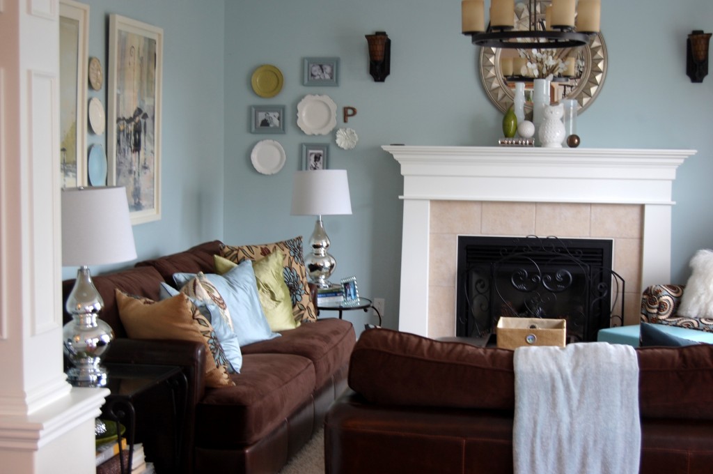
Benjamin Moore Woodlawn Blue won me over the very first time I saw it used in a Pinterest photo! So when it was time to re-paint our sage green living room, it’s the color we chose. We painted it about 5 months ago, and I’ve been slowly re-decorating the room over the past few months.
BEFORE:
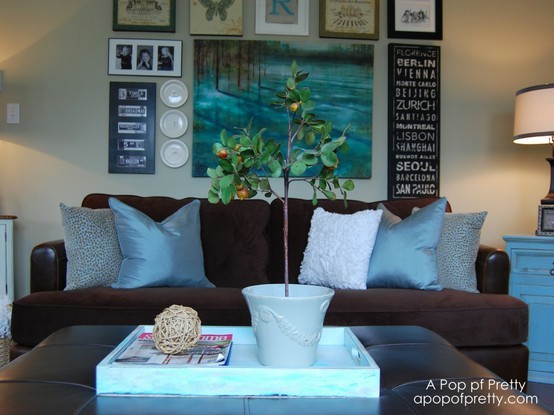
But, without accessories, the space began to feel void of personality. Isn’t it interesting how some people can live contently in a minimalist space, while others find happiness in eclectic rooms filled with their ‘favorite things’? I’m realizing that I’m definitely one of those people who draws energy from ‘collected spaces’. I began to miss my gallery wall over the sofa. (See: I Miss my Gallery Wall: The Great Debate – Simplicity vs. Eclectic / Collected Decor).
AFTER:
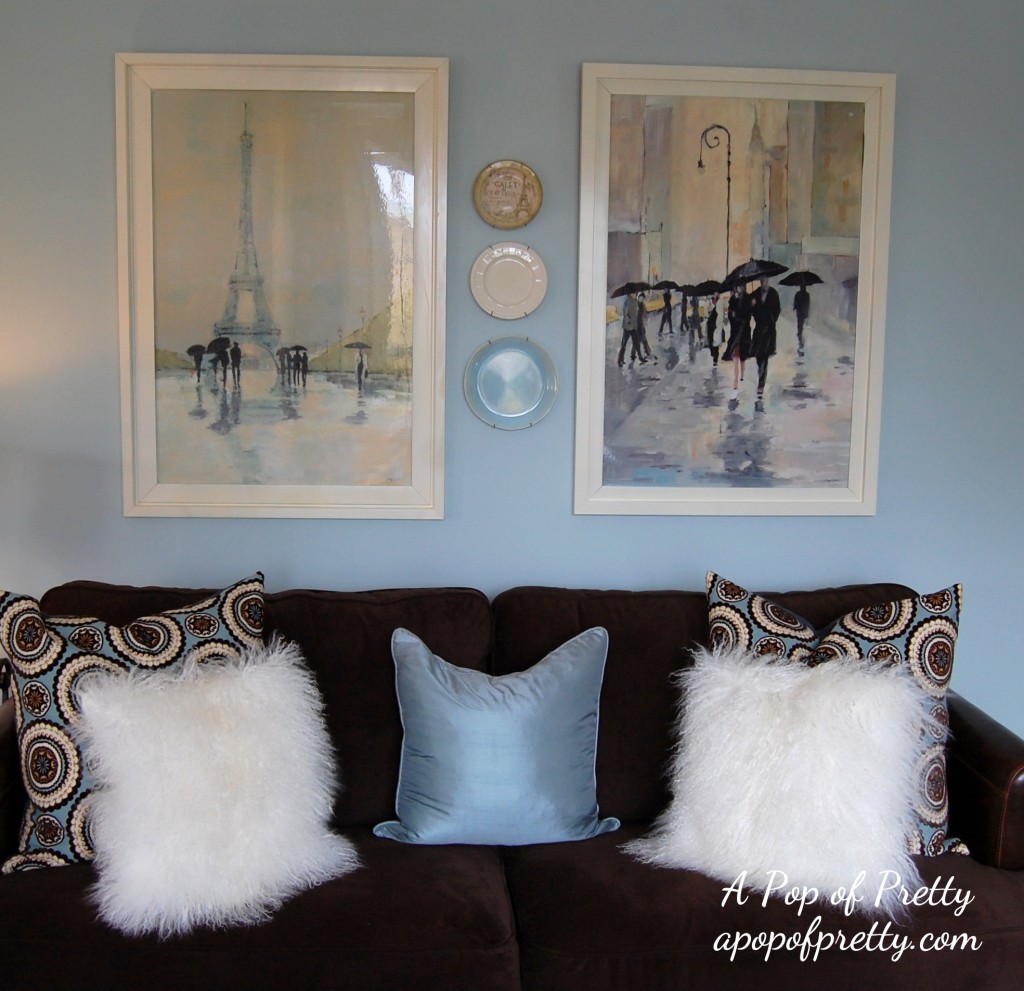
So I added some new artwork to the room, starting with these two large pieces over the sofa (below). (Note, I found them in a local store but I’ve since seen the eiffel tower piece at Z Gallerie. They are by artist Avery Tillman). You might recall that I didn’t like the color of the frames they came in so I spray painted them cream. See Love the Art, but Hate the Frame? How to change it in 2 easy steps! That’s pretty much all we had on the walls for a few months.
That new artwork satisfied my craving for “more” for awhile, but the room still felt unfinished to me. So, over the past month or so, I decided it was time to ‘finish’ it in the ‘collected’ style I’m most comfortable with!
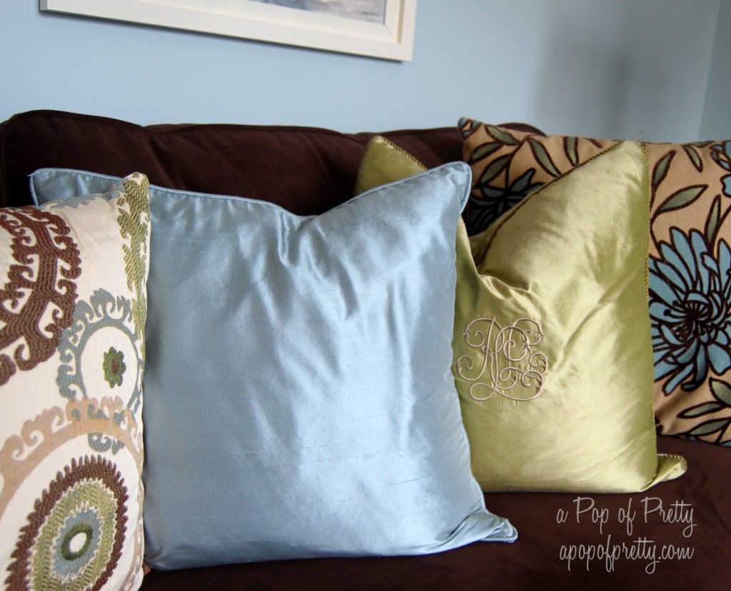
I still LOVED the muted color scheme of Benjamin Moore Woodlawn Blue-brown-cream, but it seemed like it was missing a little excitement. I tried adding this pillow – kind of a chartreusey-olivey color – and it rocked my world. (I know, I know, I’m overly-dramatic about decorating, lol!)
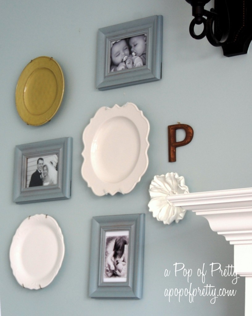
I liked it so much that decided to introduce a few pops of green to other areas of the room too. Just one plate from Pier 1 helped to liven up this gallery wall that I created on one side of the mantel.
Since our living room and kitchen/dining area are open concept, I pulled a few pops of the green into the cabinet in my dining area too. I was in the market for new mugs, anyway ;-).
So now the living room is a little more visually interesting.
Until next time,

I’m sharing this room tour at…


Love Love!! Where did you get the Accent chair with the matching pillows?
The chair is from Lane furnishings in Canada! I purchased it a few years ago, and unfortunately, I’m not sure of the name of the fabric. ~Kerri
What is the brand and name of the original painted Sage Green walls?
It’s SICO Kalahari Beige. Hope that helps!~Kerri
Love this room! I’ve been lookin for a mirror just like that! Where do you get it?
I found this mirror at HomeSense in Canada, but I’ve also seen it at Bombay Company. (Not sure if Bombay is a Canadian company or not?) but you might check there! Thanks for coming by.
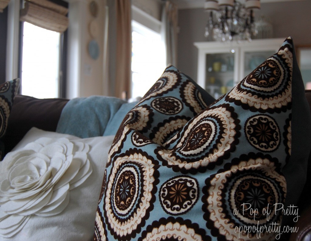
Love your decor! I have been transforming my home in the same colors! I have actually had the browns, creams and blues in my bedroom for 8 years and I still love it! Could you PLEASE tell me where you purchased the pillow on the left side of the sofa? I love it and I must admit, I have a thing for pillows!
Could you PLEASE tell me where you purchased the pillow on the left of the sofa? I LOVE the colors. I am in the process of changing my colors as well. Your design reminds me of me! I am your newest follower!
Hi, are the columns in your living room painted the creamy white also? I have columns like those in our home , it’s an open floor plan and the seperate the living room from dining room. My trim is just white, should I paint them the same white or use a creamy white? Thanks
Hi Jenn,
The columns are the same color as the trimwork (Cloud White), except on the bottom which is technically ‘wall’ so I did paint that part the Navajo White like the other creamy walls. Hope this helps, Kerri
What are the 3 colors you used on your walls in this post? We’re about to paint our living room/ kitchen open floor plan and I love the colors !
Hi Kelly! The colors are all Benjamin Moore: Navajo White (the creamy white), Woodlawn Blue (the blue) and Silver Fox (the gray in the kitchen area). Hope this is helpful! ~Kerri
Hi Kerri,
I found your blog the other day while searching for pictures of living rooms painted in woodlawn blue. That’s a color we are getting ready to paint our, currently, very beige open living/dining/kitchen area. We have a very similar fireplace with white surround and beige/tan tile. I was excited when I saw the pictures of your room – very pretty! I am curious to know if are still loving the change to blue now that you’ve lived with it a while. Big color changes scare me but I really am in love with this color. I’d love to hear your thoughts! Thanks.
Yes, I still LOVE the blue. It’s a great color to pair with chocolate browns and creams. I only used it on a couple of walls though; the area it’s in is ‘open concept’, so I paired it with some cream walls too. I think that helps to keep it feeling light and airy. Good luck with it!! ~Kerri
Thanks for replying. It helps me feel braver with this color change to know you’re still loving it. We’ve decided to start with just a few walls as you did. We have a big sample board up against the fireplace now. I can almost not stand the wait to get it on the walls! Thanks again. I’ll continue to follow your posts. Happy decorating 🙂
The magic of accessories is right! Love it!
Thanks so much! ~Kerri
First off, let me say how charming I find your site and how nice your very personal ideas are. Despite the blue, it’s fairly obvious you’re a girl. Having said that I do feel a lot of personality in that room and almost surprisingly everything works.
I confess I’m somewhat more of the minimal type but I put my hands up and say that the down side of minimal is that it lacks heart sometimes. That cannot be said by your example of how to clutter up a room tastefully. I really do like it.
I think the choice of Woodlawn blue sets up the whole room for a lot of crazy colours, but the safety in your colour choice allows every mix from the burgundy and even greens, gold’s and silver.
You have thrown in patterns and I keep expecting something to not look right with so much going on, but I can honestly say everything looks in place. There are, in principle, far too many lights and lamps and in some respects it should look a mess but it doesn’t, I love it cause it is so tasteful and personal.
You have a good eye, Kerri, and I think I should start to find a little tasteful clutter myself. Love the end product and will be following your ideas further.
This looks just lovely now! I really like the added pops of olive green! Just what it needed!