Well hello blog, and hello again 31 Days of Wall Decor Ideas!
This week has been a little crazy for a few reasons, one of them being these shenanigans—–>
So, despite my very best intentions to blog every day this month for my “31 Days” series, real life has gotten in the way. I hope to get it back on track from here, but let’s be real: even without birthday party planning for two 3-year olds, our household is a gong show. There might be a few more hiccups along the way, but I am enjoying all these DIY wall art ideas too much to give up on the series now!
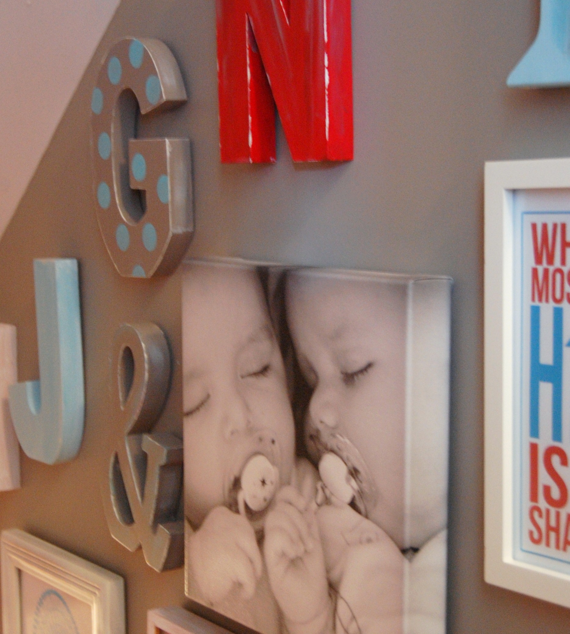
So tonight I thought I’d throw a few more ideas into the mix by showing you the ‘alphabet’ inspired wall in our basement stairwell again.
You might notice that I’ve added a few new pieces to the wall since I first wrote about it last winter. I talked about the free printable art I used on the wall earlier in the series. But before I point out the other new pieces, let’s add ‘Letters & Numbers’ to the growing list of do-it-yourself wall ideas which you can now find in my right sidebar!
Idea #12: Letters & Numbers
I’ve been a huge fan of using letters and numbers as wall art for awhile now. (Check out my post from 2011 “I Wanna Buy a Vowel: Gaga over Alphabet Walls“). I’ve used letters in different spots throughout my home (like here in my living room), but I haven’t grouped them together like this anywhere else. They really add a happy, whimsical feeling to the space.
I collected each of them – which represent our family initials – over time. I didn’t want them all to look the same, so I waited until I found some giant ones (harder to find at a good price), to mix up with the smaller ones. Once I had them all, I painted them in fun colors that matched the color-scheme of our basement decor. If you haven’t seen that space yet, you can find the link in the post, “Featured at Apartment Therapy Family: Our Colorful, Play-Inspired Basement Family Room”.
If you like this kind of a look too, then keep you eye out for wooden or metal letters at places like Winners or HomeSense (Canadian). You can also find a range wooden letters regularly in stock at craft stores like Michaels. I’ve also seen cool vintage letters and industrial letters on sites like Fab.com, but I’ve never purchased them there as the ones I’ve spotted were pricey. If you are lucky enough to live near great antiques or thrift stores, you might luck into some cool letters there too!
Idea #13: Photo-to-Canvas Wall Art
When I first posted about this alphabet wall back in the winter, a Canadian company called Posterjack contacted me to ask if I’d be interested in adding one of its photo products to the mix.
Until then, I hadn’t really considered including more than our family initials on the wall, but it sparked the idea to add some of our cherished family photos.
One of my favorite ways to display art has always been on wrapped canvas, so I took Posterjack up on its offer, and tried out their photo-to-canvas option with a picture I took of our twin boys while they were infants.When the piece arrived, I was giddy with excitement over how great the photo looked. The quality of the reproduction to canvas was outstanding, and it was wrapped around a sturdy wooden frame.
Even though Posterjack did the work of putting it on canvas, I’ve still included it as a ‘do-it-yourself’ wall decor project here because I love the idea of creating highly professional-looking wall decor with photos you’ve taken yourself – especially if you are simply a recreational photographer like me. If you live in Canada, Posterjack is a great option for having photos put on canvas. If you don’t live here, then I’m sure there are other suppliers in your country of residence as this seems to be an increasingly popular photo development option these days.
Once the canvas was hung, I also decided to include some other favorite photos in the mix, and I think they all helped to give the wall more personality!
Idea #14: Etsy Shop Prints!
Be sure to pop back tomorrow when I’ll tell you a few of my favorite Etsy shops to buy wall art – like the adorable “Today I will be happier than a bird with a french fry” – print you’ll find on this wall.
Until then,
(P.S. Throughout October, I’ll be posting lots more ideas in this DIY Wall Art series! You can now find a running list of ideas in my right-hand sidebar.)
Pin It
So have you heard of “31 Days” before? Well, if you follow many blogs (especially in the world of crafting, DIY or home decor), you might be hearing that phrase a lot in the coming weeks! Nester, from Nesting Place (my favorite blog evah) came up with the idea a few years ago to write about one topic of interest every day for the 31 days of October. Last year, hundreds of other bloggers joined in, including yours truly.
You can spy on my 2011 “31 Days” Series on Vintage Home Decor Advertising by clicking here:
I wasn’t sure if I’d accept the challenge this year or not. I enjoyed the process, but for somebody like me who blogs just a couple of times a week at most, the reality of executing 31 posts in a month was tricky business. Some days, my kids ate PB&J twice, just so I could blog. OK, I lie
. But I will admit to cheating a few days here and there by doubling up on posts just to get a day off.
The thing is, last year’s series on Vintage Home Decor took a lot more effort than I imagined. On a positive note, I learned a lot about the history of home decor (yes, I’m a decor geek), but I over-committed by choosing a topic that took a lot of research. So if you are a blogger and thinking of joining in this year, that’s an important tip: find a topic that you can execute relatively quickly and easily. Taking my own advice, I decided to join in again this year, but picked a topic that I know I can commit to…
One of the things I love to share at A Pop of Pretty is great Do-It-Yourself Wall Art Ideas. Wall art can be expensive, and also, it’s often hard to find something that expresses a room’s personality exactly the way you want.
While I still vote for having some pieces by ‘real’ artists in your home, I definitely think there’s a place for hand-made art. Personally, over the years, I’ve made everything from painted canvases to nursery and playroom art to framed monograms…
I’m itching to share a bunch more easy and affordable wall art ideas in October. Starting on Monday (yup, peeps, Monday is October 1st!), I’ll post an idea a day. That’s 31 in total! You are sure to find some inspiration in the bunch. You won’t believe how easy it is to create something fabulous!
See you then!

As tomorrow is October 31st, this is going to be my last post in my 31 Days Series on vintage home decor advertising. I will miss it! By digging up these old ads, I learned a lot about vintage decorating that I didn’t know before. And, because ‘old’ always becomes new again – whether in fashion or home decor – I now feel a little more able to appreciate the history behind ‘emerging’ decor trends. At the same time, it will be nice to have the series behind me. It’s hard to commit to posting here e–verrrr–y day! I’m not a full-time blogger – not even close.
Plus, I’m getting excited about the holiday season that is fast approaching (insert a happy dance here)! That means I’m looking forward to sharing holiday craft and decorating ideas over the next month.
Tonight, to end off the series , I’m going to share some of the remaining ads that I collected. I know that normally I add some context and insight around the ads for you, but frankly, tonight I’m pooped. I think you’ll enjoy them nonetheless. I love how, as a collection, they show how our culture evolved over the past 5 decades – especially the the role of and portrayal of women. That’s the beauty of vintage ads. They are little windows on the past.
So here you go…
I hope you’ve enjoyed the series! A huge thanks to those of you who visited regularly!
And…congrats to all the other 700+ bloggers who committed to a 31 Days Series of their own. You rock!
Have a safe and happy Halloween!
~Kerri
Sorry for the delay in posting Day 27 of my “31 Days” series on vintage home decor advertising, but I literally broke my blog.
{I went snooping around in the back areas of my site where I shouldn’t have, and played around with a bit of code, just cause I’m curious like that, lol. Um, BIG ooops. Who knew a few misplaced punctuation marks could break a web site?!? Well, apparently, coders know that. And thank god for them. They fixed it all up for me, but only after an hour or two of cardiac arrest. Oh the joys of owning a self-hosted blog!} But I digress..
As a little celebration that my blog crisis was averted, tonight I’ve got some absolutely gorgeous late 50s to late 60s telephone ads.
Telephones might not be considered home decor accessories today (in most homes anyway), but they were all the rage in mid-century homes.
This first ad is from the late 50s (maybe 1959?). Long before the invention of cordless phones or Blackberries, I bet the idea of having a second telephone line in your kitchen was a real luxury to the ’50s Housewife!
The ad markets the benefits of “a kitchen extension line” as a way to better run your home. It also touts the fact that a pot won’t boil over because you won’t have to leave the kitchen to take a call. Well, yah, but who’s watching those kids lick the beater while Mrs. Happy Homemaker gossips with her BFF, lol?!?
I don’t know about you, but I am totally digging that pink phone. So pretty.
And speaking of pretty phones, check out this next mid-century ad from Western Electric (below). Aren’t those pretty pastel colors just stunning? I wish phones like that were still widely available today. Instead, we have to settle for boring old black or silver.
The copy in the ad states that two-thirds of all new phones that Western Electric would produce that year would be colored, while only one third would be traditional black. So cool!
It’s also kinda neat that the ad shows which hues were the most popular at the time. Over a quarter of consumers liked that icy blue. That’s my choice too, followed by pink!
Finally…in my web travels, I also tracked down this absolutely fabulous poster which shows how telephones evolved over time up until about 1969.
That final 1969 ad on the poster totally cracks me up…
The copy reads “Some day you will see who you are talking to, and let them see you”.
(Yes you will, and it’s called ‘Skype’, teehee.)
Hope you enjoyed these as much as I did!
~Kerri
If you’ve been following along my Vintage Home Decor Advertising Series, you’ll have noticed that I’ve made an attempt at presenting these vintage ads chronologically. That means we are almost up to the 90s.
Well, peeps, the 90s might be considered vintage by some, but personally, this girl refuses to accept it, lol. It was the decade I finished high school and graduated with my undergrad degree, so there’s no way the 90s can be vintage yet, or that might mean that I’m vintage. Yikes.
So today’s ad, from 1990, is going to be my absolute cut-off point for these vintage ads! Over the final days of the series, I’m going to select a few more of my favorite vintage ads from past decades.
But for today, I’ve got a great one from 1990. If vinyl, or more formally, ‘Naugahyde’, was the signature, easy-clean fabric of mid-century decor (see above right), then the 1990s’ counterpart had to be micro-suede!
It seems that no one is exactly sure when and where microfiber was first developed, but most of the sources I read said it was most likely invented by the Japanese during the mid-1970s. But it wasn’t commercially marketed until the 1990s, which was when today’s ad was introduced.
Back then (and still today, really), it was seen as a miracle fabric – so good that it was possibly “A Fabrication of Your Imagination”. Heralded to be as soft as real suede, yet durable and simple to clean, micro-suede began showing up on furniture everywhere – just like on this ‘oh so late 80s’ color-blocked chair! And, of course, when lounging in chair as fabulous as this, you’d have to have your very own color-blocked micro-suede pant suit to match!
Apparently, one of the big advantages of micro-suede was its ability to hold color, so that’s why you’ll see some crazy vivid furniture in this fabric.
Micro-suede is still hugely popular today, but thankfully in furniture colors and styles that are much less, um, jarring. (Although, there are still some pretty ugly pieces out there done in this fabric!)
Personally, I’ve never owned a micro-suede couch, but I do have friends who swear by them. So how about you? Is micro-suede your miracle fabric?
Hope to see you back here for the final 5 ads in the series!
~Kerri
Tonight, we’re still kicking it ’80s style in my series on Vintage Home Decor Ads.
With its over-the-top floral frou-frou and crazy crimped hair, the 80s certainly had its share of bad taste. As we’ve seen over the past few posts, nowhere is this better documented than in the decade’s (now vintage) advertising.
But for all it’s cringe-worthiness , the 80s also had style.
In fact, it was the decade that the world would meet it’s most famous taste-maker.
“I invented ‘It’s a good thing’ before you were even born.”
- Martha Stewart
It was in the ’80s, that Martha Stewart really rose to fame. After a series of successful home-making books in the early to mid 1980s, Martha debuted as K Mart’s “entertaining and lifestyle consultant” in 1987 with this ad…
In 1989 Martha was already well-known enough to make her first appearance on the David Letterman Show (Source: YouTube)! When she visited again just two years later in 1991, Dave was calling her “the world’s foremost authority” on “gracious living”. Go Martha!
Looking back on some old clips, I couldn’t help but notice how much more relaxed she seemed back then.
Check out this 1991 vintage David Letterman clip of Martha and Dave carving two 500 pound pumpkins with chainsaws! I love how she laughs at his antics but still maintains her classic Martha polish.
Love her or hate her, there’s no denying that Martha Stewart is the queen of creating million dollar style on a penny budget!
Personally, I happen to love everything that she (and her now very large staff, lol) creates!
Only a few more ads left to come.
Oh how I’ll miss you “31 Days”!
See you tomorrow.
KL
PS I LOVE, LOVE, LOVE getting comments! So, come on peeps, don’t be shy!
Wow, this is the final week of the “31 Days” Series which has been happening all over the blogosphere for the month of October. For the past three weeks, there’s been over 700 bloggers talking daily about topics that inspire them.
When I decided to commit to the 31 Days Series, I never imagined how much fun I’d have. But by combining two areas that I love – advertising (my ‘day’ job) and home decor – I was pretty much assured to enjoy it!
With that said, I am deliberately breaking away from vintage home decor ads for this evening because I just couldn’t resist bringing you this awesome vintage ad for ’80s hairstyles!
It wouldn’t be so hilarious if I didn’t have pictures of me in junior high with that hair on the far left, only shorter and pouffier. I do, I swear.
I cracked up reading how 80s hair is described on the site “Like Totally 80s”…
For those of us who were there, 80s hairstyles make us cringe with embarrassment. For those who weren’t, well, you can stop laughing now. What was it that caused us to wear our funky 80s hairstyles like a badge of honor? From the bangs that reached for the heavens with frizzy passion, to the extremely asymmetrical new wave social hair statement, to the funky side ponytails walking hair-in-hair with the mullets, hairstyles in the 1980s were about excess, experimentation, and enough hairspray to protect our heads when the Russians dropped the bomb.
Sooo funny.
And if you want a few more chuckles, pop over to their page of 1980s yearbook photos. It’s a scream.
So were you a crimper or a teaser…or..BOTH? (‘The teased crimp’…now that was really something!)
See you tomorrow!
~Kerri
Welcome to A Pop of Pretty, a Canadian home decorating blog that chronicles my love of home decor and pretty things. I'm out to prove (mostly to myself!) that a pretty home is still possible amid the circus of 3 young kids, including twin toddlers. {More...}Subscribe via RSS…
or Subscribe via e-Mail
Click here for e-mail subscription form.


Archives

Here’s what’s trending (last 48 hrs):
-


Canadian House and Home Blog
Close preview
Loading...Centsational Girl
Close preview
Loading...Dear Lillie
Close preview
Loading...Funky Junk Interiors
Close preview
Loading...Miss Mustard Seed
Close preview
Loading...Nesting Place
Close preview
Loading...Southern Hospitality
Close preview
Loading...The Inspired Room
Close preview
Loading...The Lettered Cottage
Close preview
Loading...The Stories of A to Z
Close preview
Loading...The Yellow Cape Cod
Close preview
Loading...Young House Love
Close preview
Loading...


